

With inflation and living expenses at their highest now, basic needs such as food and shelter are becoming unaffordable for the average family. Houston's homeless population has increased over the years in our community. The Coalition for the Homeless collaborates with several Houston organizations to provide shelter and necessities for those in need.
However, navigating the Coalition for the Homeless website might be confusing for some who want to learn more about the organization. This redesign helps users understand the Coalition's goals in assisting the homeless, giving users more trust in the organization.
As a team of three, we collaborated on user research, rebranding, user experience, and user interface. In the user research phase, we worked on planning questions for our stakeholder interviews and understanding the user, such as creating the user persona, journey map, and user flow. We also designed the rebranding and individually worked on the different pages of the desktop and mobile websites.
Before deciding what to redesign the Coalition for the Homeless website, we need to understand the user's problems with navigating and understanding the non-profit organization. We also wanted to know the user's feelings and perspectives about the organization.
From our interviews, many people hesitated to donate to non-profit organizations because they needed to be more transparent about where their donations were going. They also felt more frustrated when they needed help finding information about the organization's work on their website or social media.
Many people interviewed say the issue of homelessness is only growing since they can only do so much to fix some of the problems, but not the more significant issue, which is affordable housing and minimum wage. They want people to collectively be more aware of the case so organizations can provide more changes.
We also interviewed a development associate working for the Coalition for the Homeless to learn more about the organization and ask questions about its current website. We gathered that the Coalition for the Homeless isn't a direct service agency, so they collaborate with more than 100 partner agencies to help the homeless. This finding clarified our confusion about the navigation label "The Way Home."
Also, we asked if there are things they want to improve on their website, and they said the Help Card page is the most significant issue users had when navigating on their website. Although the Help Card page is simple with dropdown lists, users will have a hard time understanding the purpose of this page since it lacks the Coalition for the Homeless site navigation, confusing labels for buttons, and no description of the page.
Allie is a software engineer who is an activist for the homeless community and wishes organizations had more transparency regarding where people's donations are going. When she visits the Coalition for the Homeless website, the organization doesn't elaborate on the distribution of donations, and some of the information architecture is confusing. Hence, she needs help searching for topics she wants to learn more about.
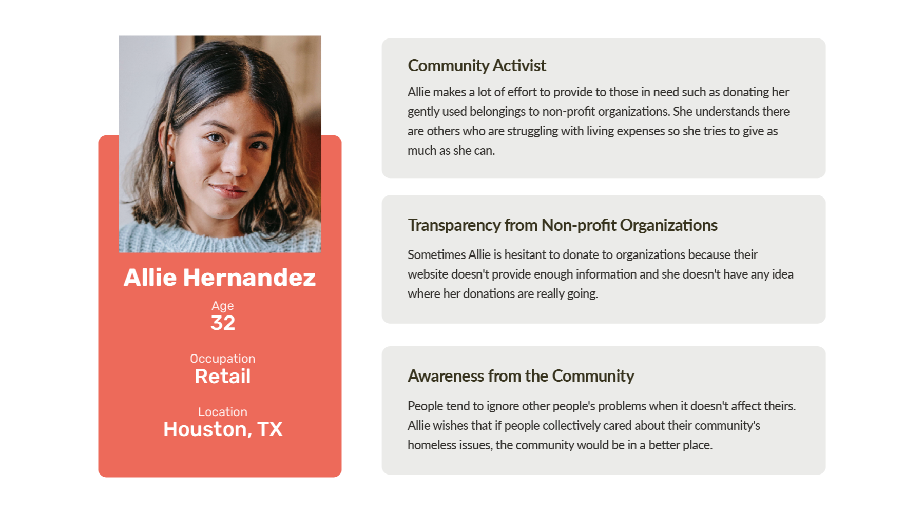
Community activists like Allie want to assist the lost cause in her community. They are hesitant about donating to non-profit organizations since they need to be more transparent about where their donations are going. Redesigning the Coalition for the Homeless website will help users like Allie to understand the organization's goals of assisting the homeless in her community.
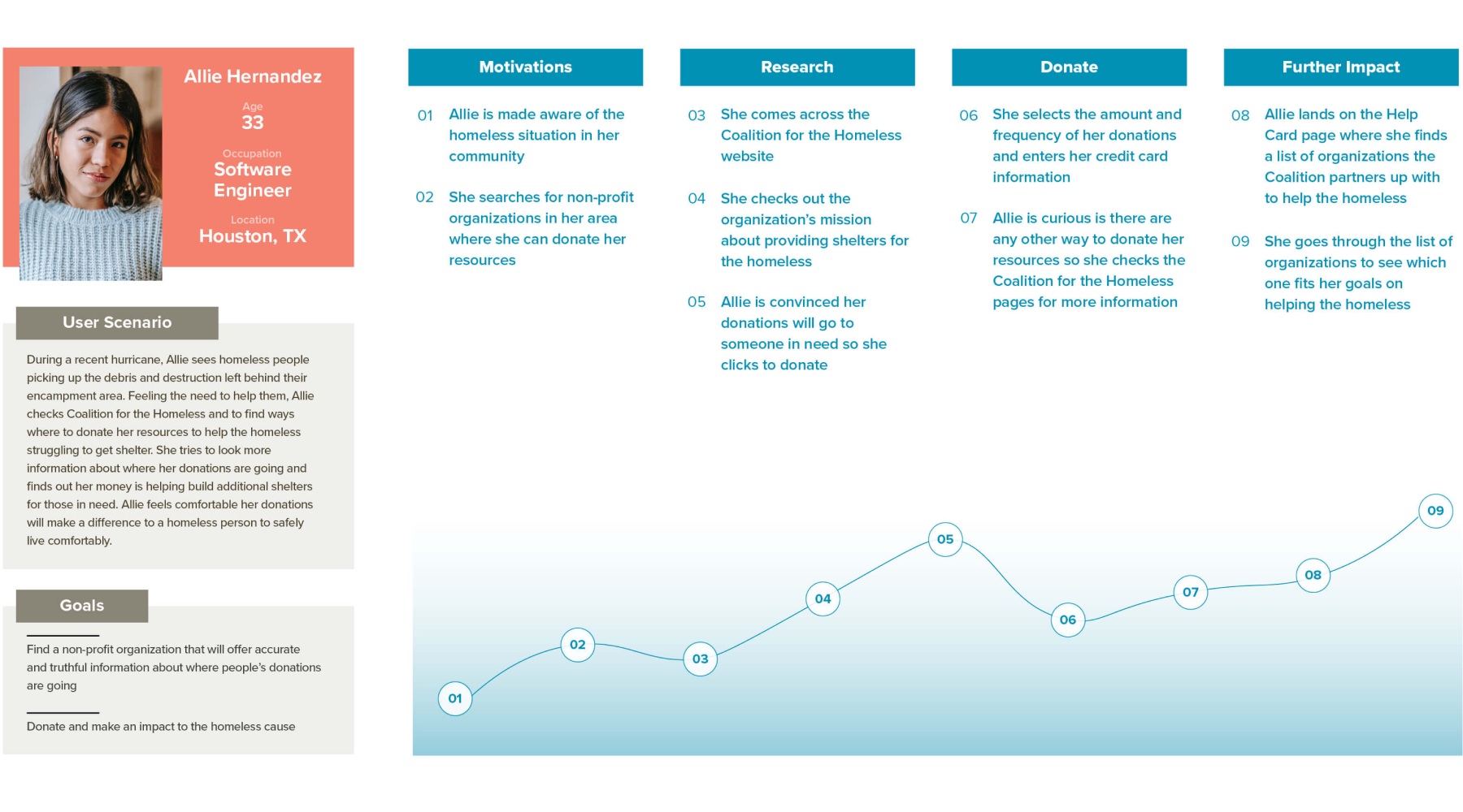
As a team, we used our user interviews to understand user needs and create a journey map for a community activist, such as Allie, when navigating the Coalition for the Homeless website. She's aware of the homelessness in her community and decides to research more about local organizations that help the homeless. She learns about the Coalition for the Homeless mission and where the donations will help the community. Allie trusts this organization because they are transparent about donations, and she decides to donate to them.
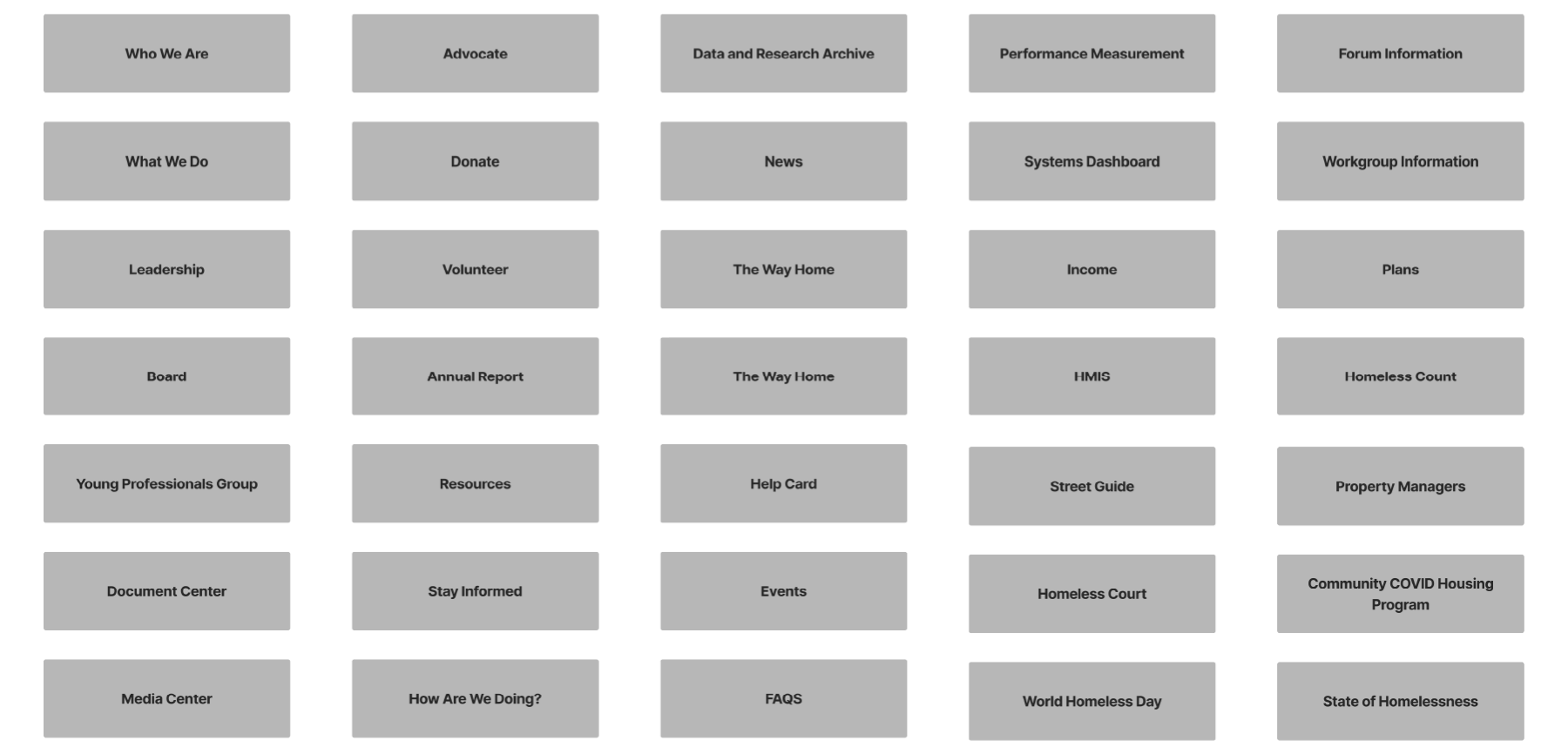
We took every page from the navigation and labeled cards for each. After shuffling the cards, we worked on grouping similar cards and removed copies while discussing to get feedback. Once we have defined groups, we labeled the groups, which would be the main navigation, and the cards in the group would be the secondary navigation.

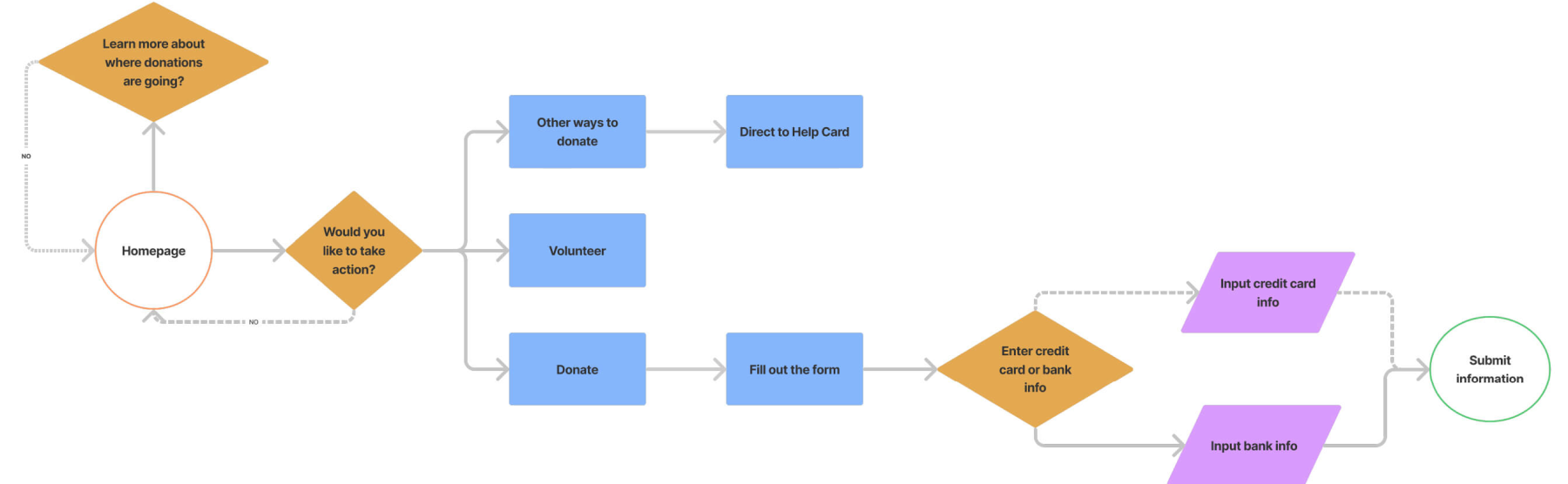
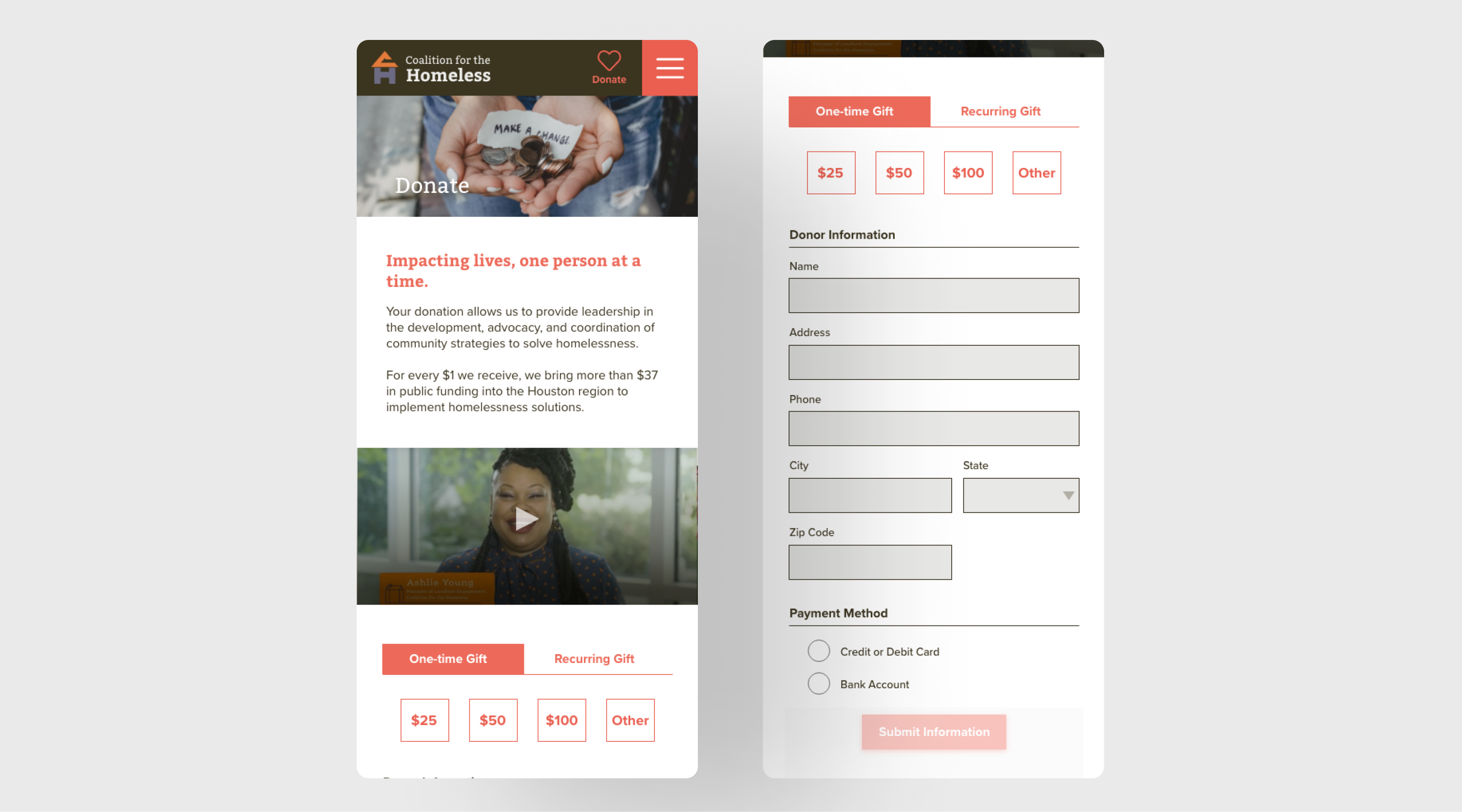
For the user flow, we created an experience where the user wants more information about donating to the Coalition for the Homeless and going to the Donation page to donate. The user also goes through the checkout process after deciding to donate.
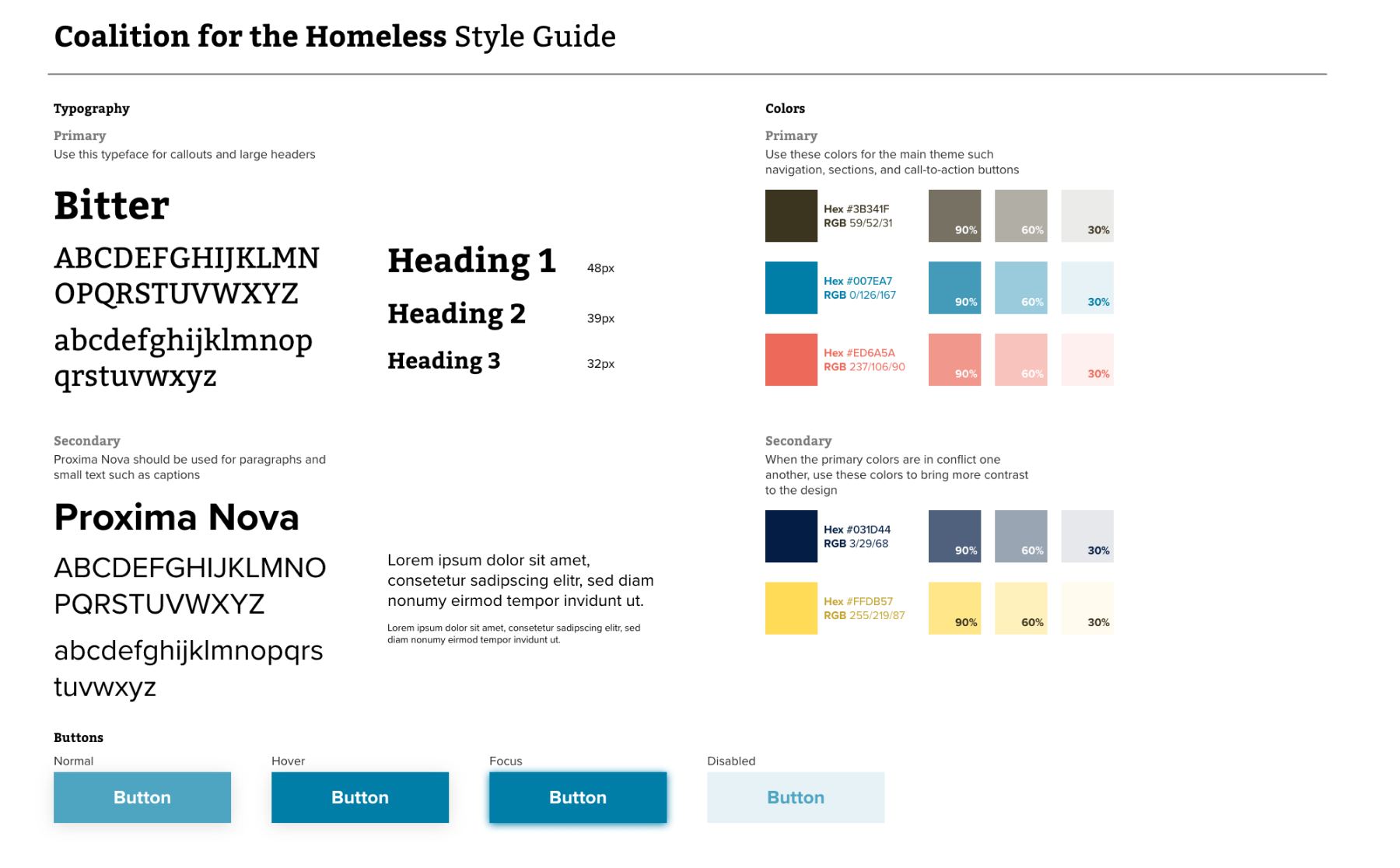
To emphasize trust as a non-profit organization, we decided to use dark brown and blue colors to keep them neutral and complement each other. Coral red is another color we chose, contrasting dark brown and blue, providing a call-to-action color.
We also wanted to use a serif to portray trust, so we chose Bitter as the primary typeface and Proxima Nova as the secondary typeface, where readability is necessary.
As a team, we individually designed our paper prototypes and had people test them on Invision. We took the testing feedback and discussed it as a team to see which features were essential and what needed improvement. Some feedback we received is fixing the call-to-action language and organizing the layout by importance.

My team worked together to design the layout and create a high-fidelity prototype on desktop and mobile sites. We divided the work into different pages on the site: I worked on the homepage layout, another teammate worked on the donation page, and another teammate worked on the checkout donation experience. After finishing the desktop version, we all changed roles on pages to work on and collectively critiqued the work we completed.
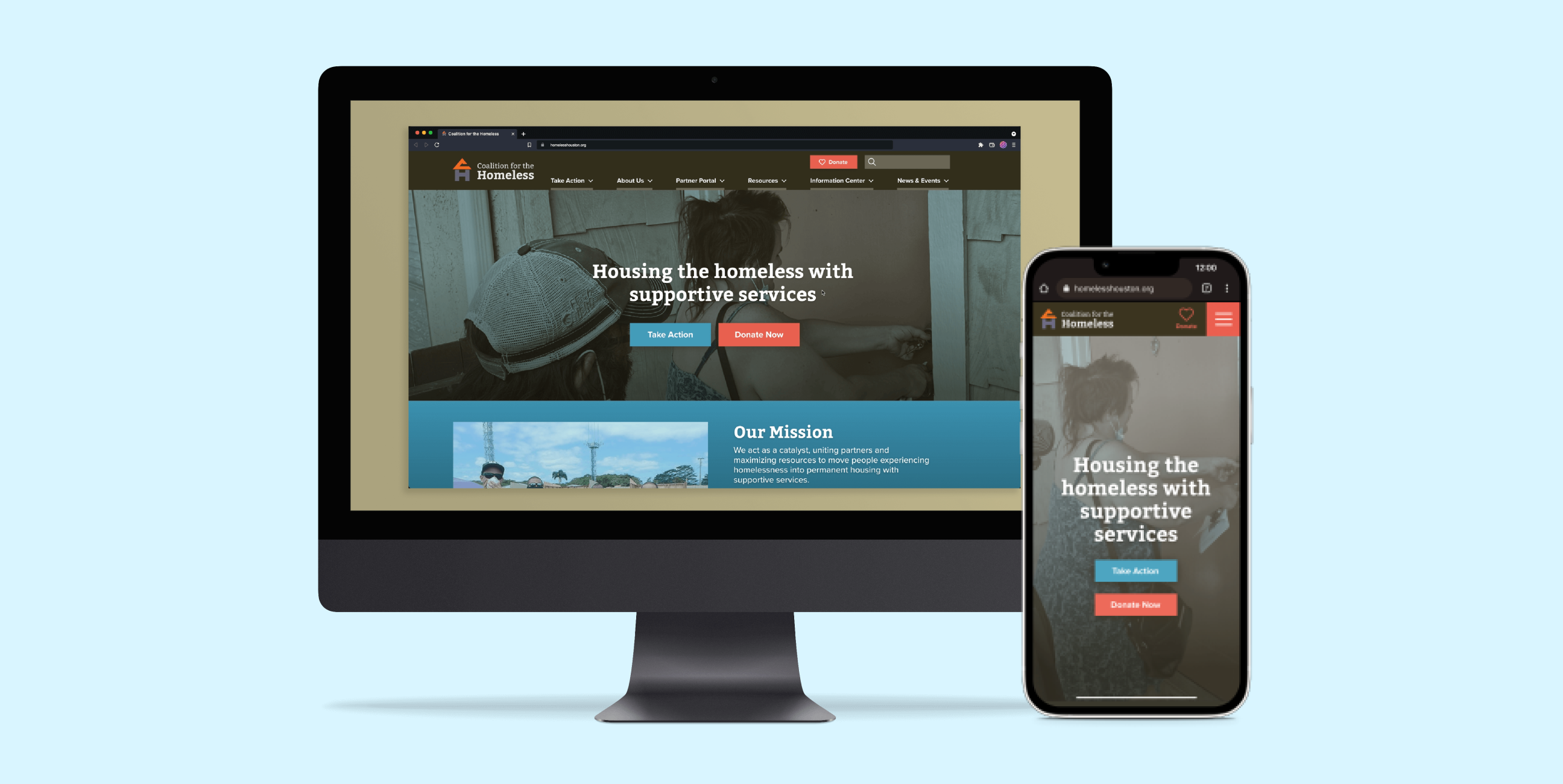
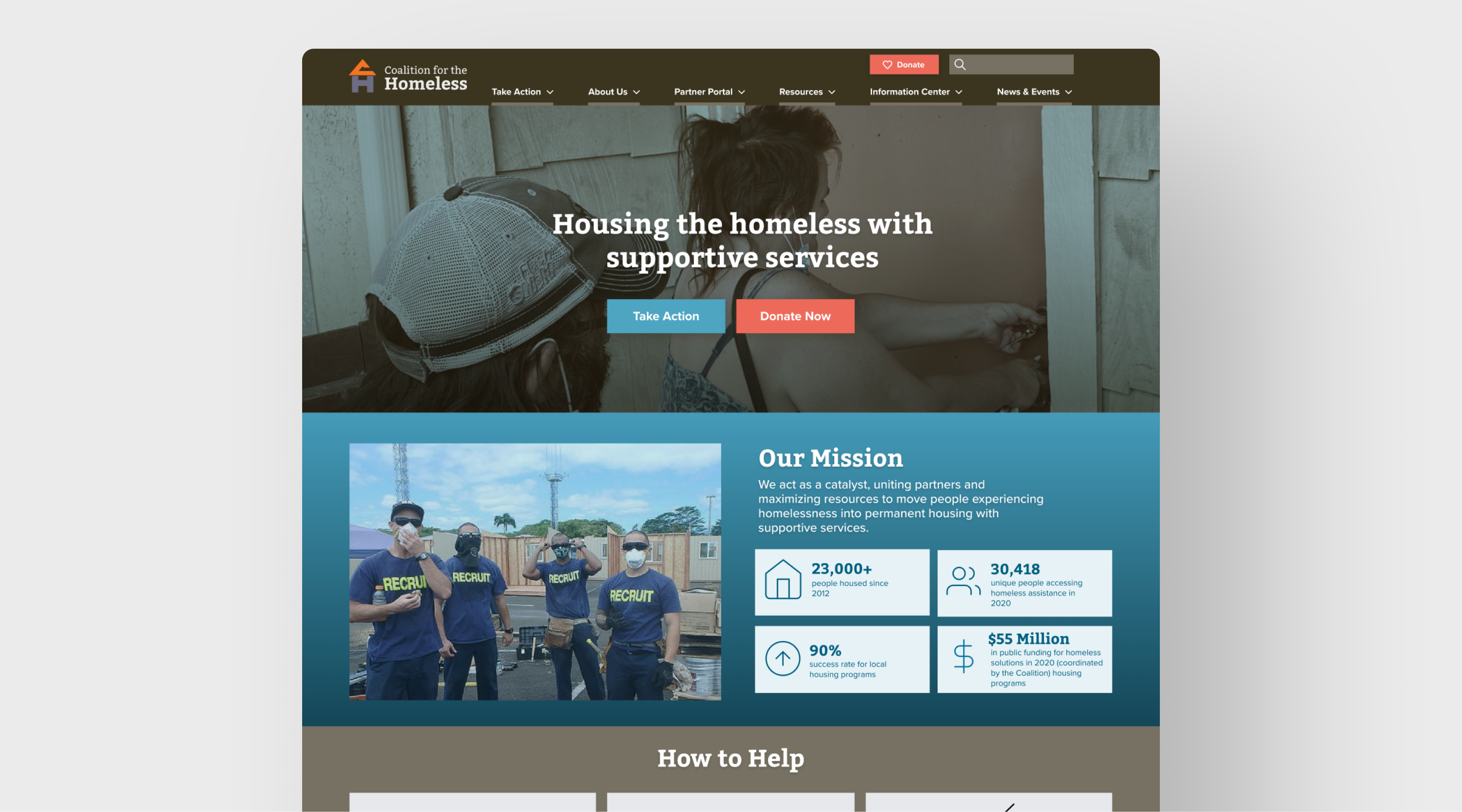
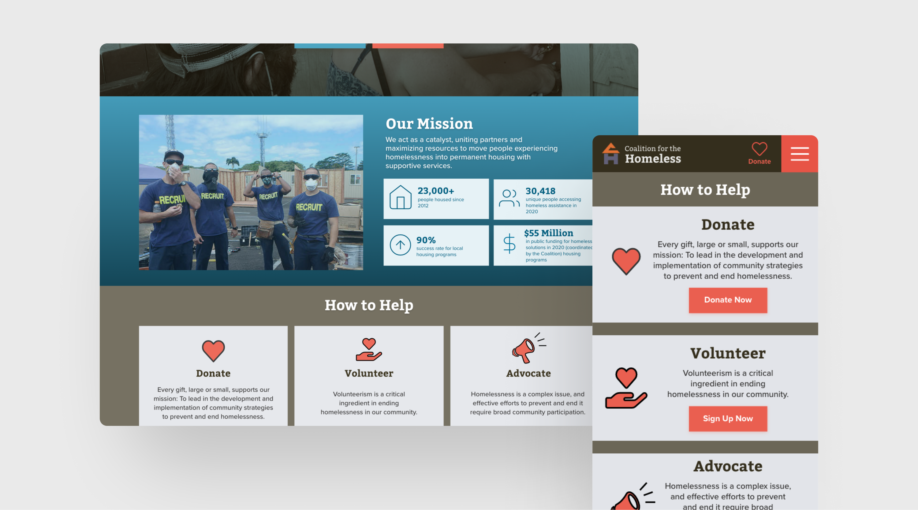
We redesigned the website to have a large hero header and noticeable call-to-action buttons to attract users to the site. The large header is simplified to grab attention through short yet informative language so the user understands what the Coalition for the homeless does as a non-profit organization. Also, information is divided into sections, so the user can quickly skim through the data and search for information.
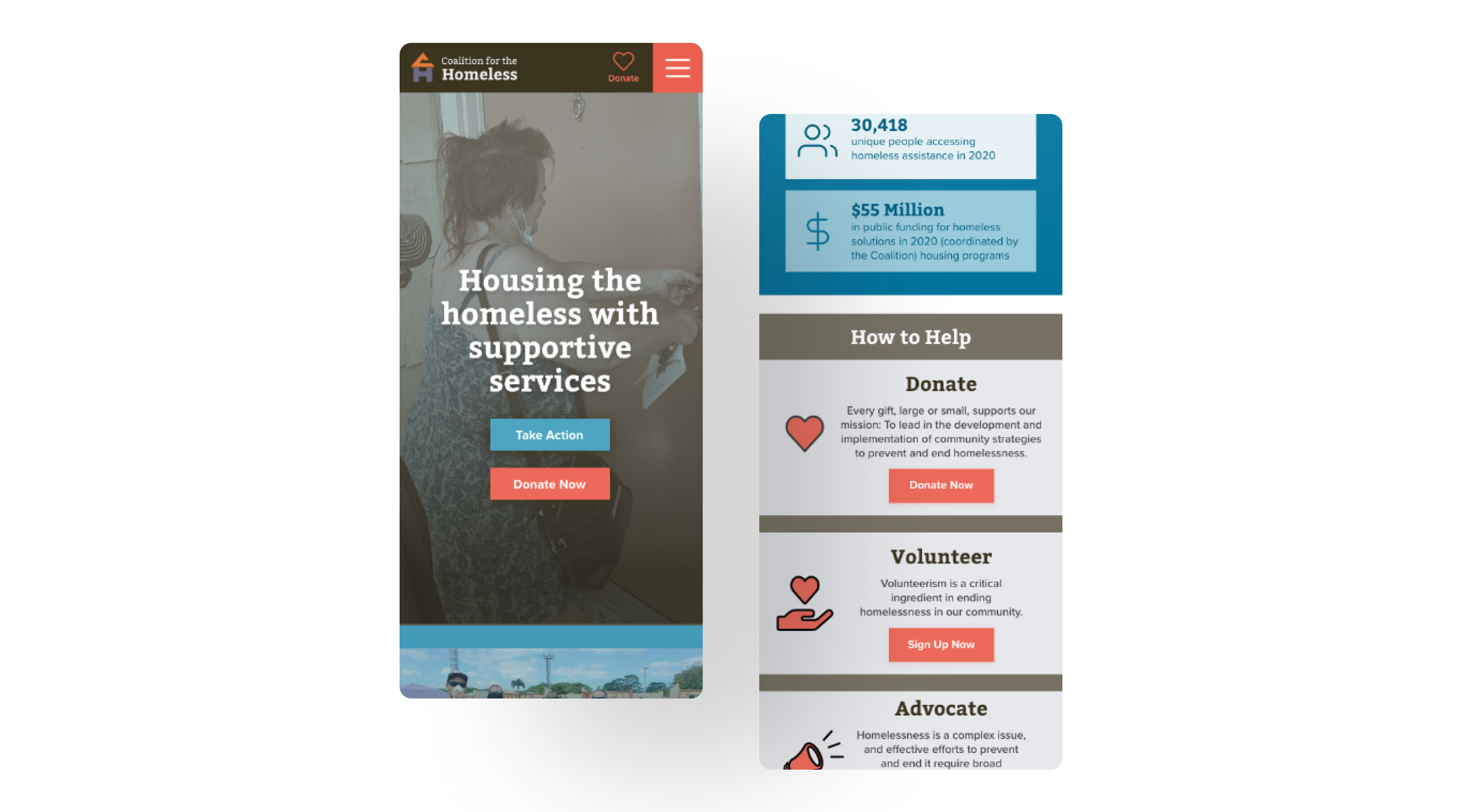
Similarly, the mobile site has a better, organized layout where the hero header image takes up the portable screen once the user lands on the page and has clear call-to-action buttons. Navigation is located on the top right and collapses when landing on the page.
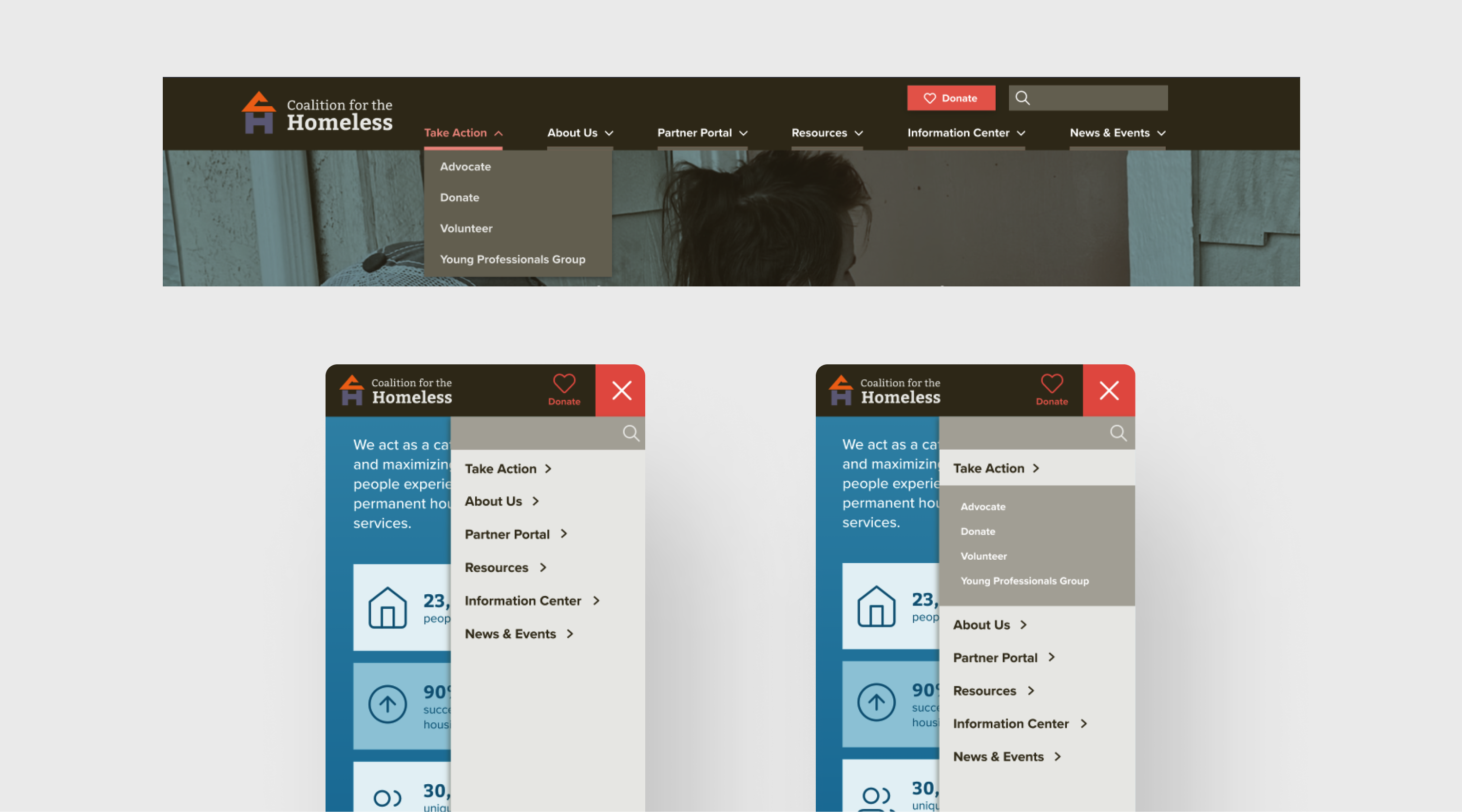
One of the issues users need help with on the current website is the confusing navigation labels. During our card sorting, my team discussed renaming the labels, so it's more straightforward for the average user to understand where the pages lead instead of clicking and guessing. We simplified the labels with a clear dropdown and secondary navigation.
We collapsed the menu at the top right on the mobile site with a hamburger icon. The navigation header is static at the top when users scroll down, which allows them to access the menu anywhere on the page. Once the user taps the menu, the drawer will appear on the right, and the navigation links will appear. Tapping the navigation links will open the secondary navigation links.
When users tested the current website, they were frustrated when they couldn't find information about the Coalition's work on Houston's community without stopping and reading it in a wordy paragraph. We broke down the information into smaller chunks through card components. The cards helped users search and locate information quickly. Card components are also responsive, which is helpful for other screen sizes, such as mobile.
The current donation experience requires users to go through several pages. The donating experience could have been better because users must recall the amount they donated since they don't show it when they go through the steps. Also, they have to go back steps to change the donation amount. Creating a form on the same page would help users complete and modify form inputs without struggling to recall information.
The Coalition for the Homeless website redesign is improved so users can easily understand the organization's mission, making people like Allie comfortable donating. For future developments, we want to explore redesigning the Help Card page since the stakeholder sees it as the most significant issue users have when navigating their website.
©2023 Michelle Lam