

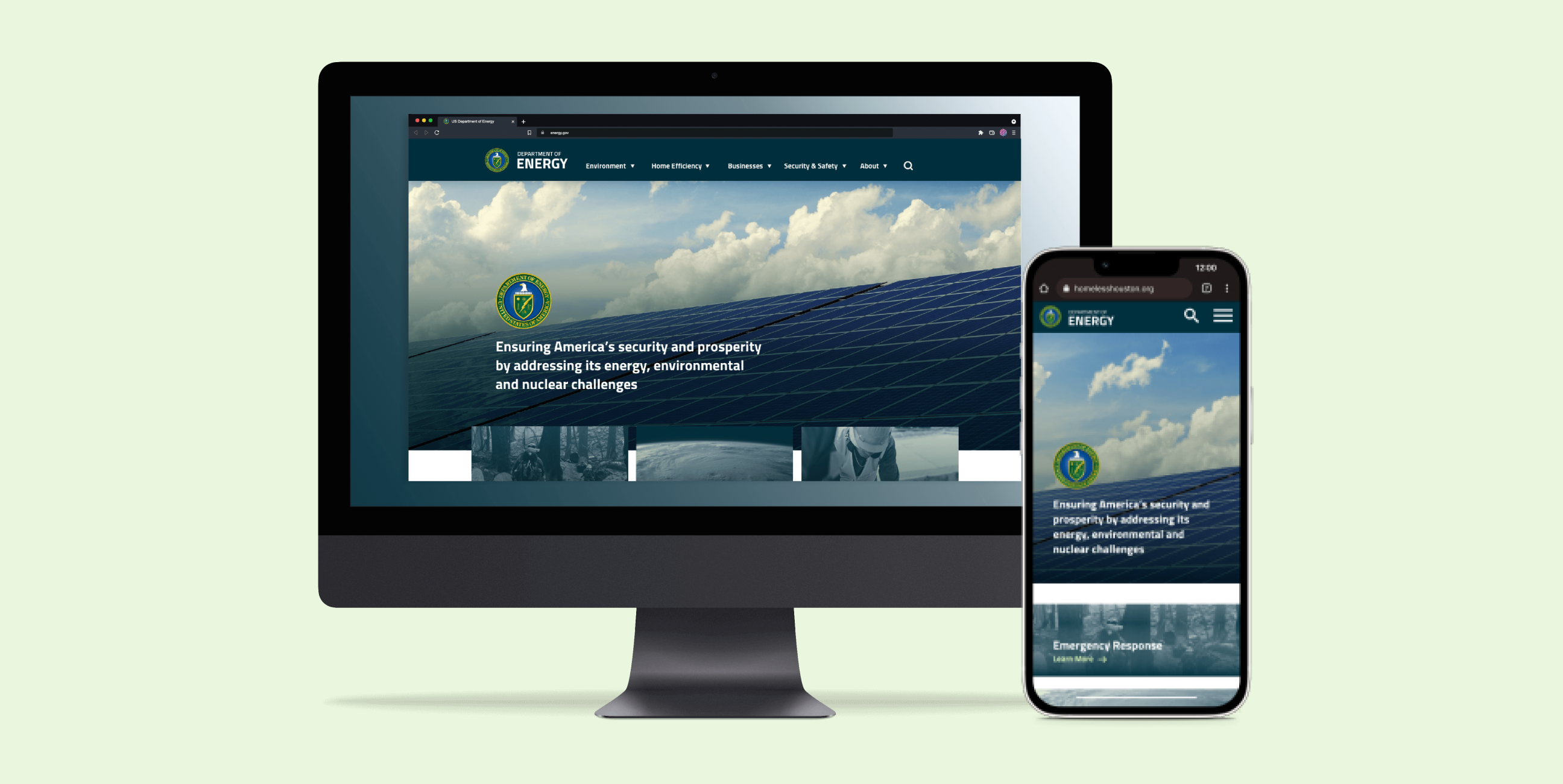
The Department of Energy website could be more intuitive for the average user because the user experience is hard to navigate, and they use industry jargon on the navigation links. My goal for the redesign is to create a user-friendly website for all types of users and reorganize the information for easy readability and visual hierarchy.
I collaborated with a teammate on user research such as the proto-persona. We also worked on determining the user path, redlining the website, and card sorting. My role focuses on user interface design, including creating the style guide and low- and high-fidelity designs.
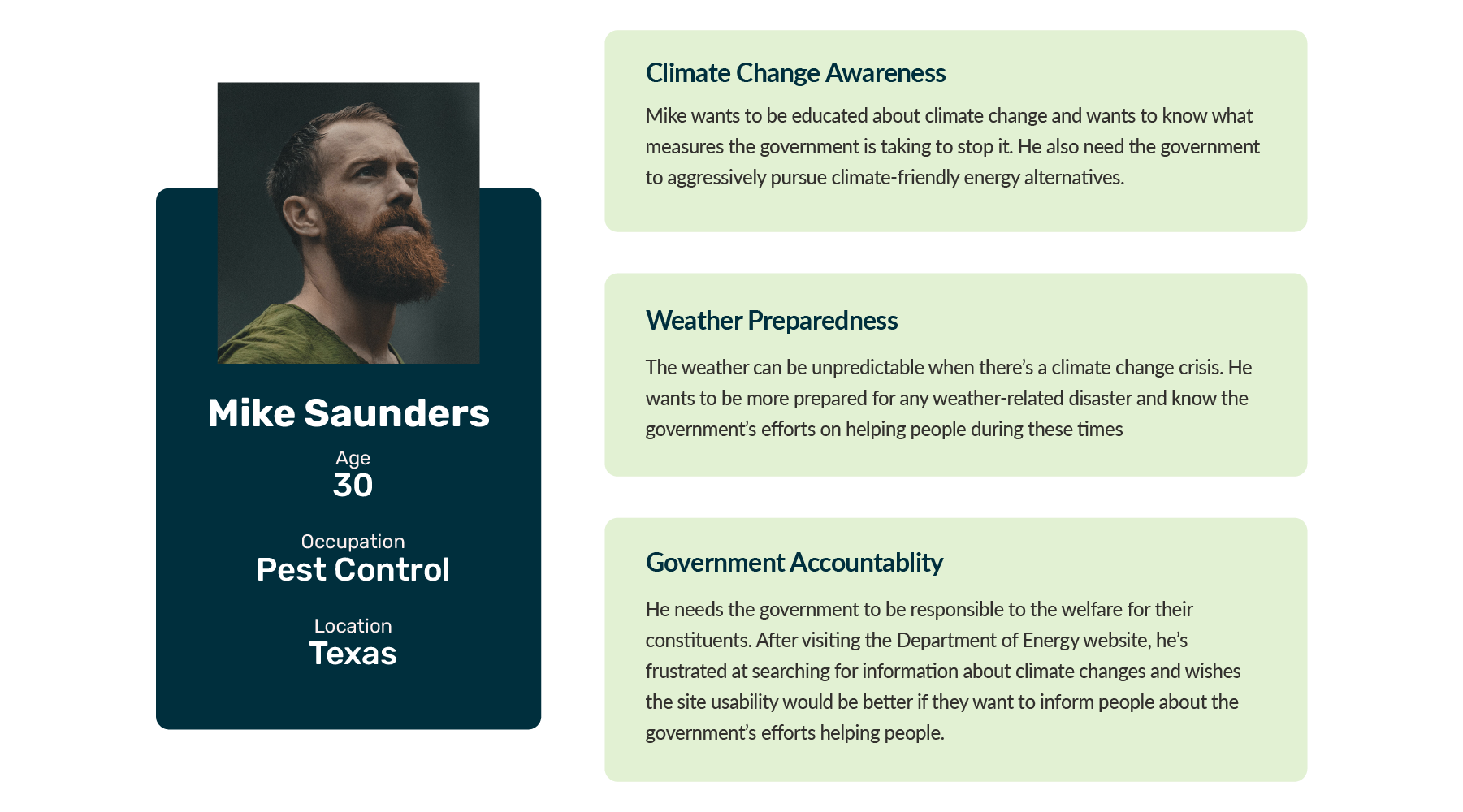
Mike is troubled about the turbulent weather systems these past years. Especially the recent freeze that blew out the Texas electrical grid, he had to deal with several days of no electricity and water. Before, he was indifferent about climate change, but now he's more aware and doing research.
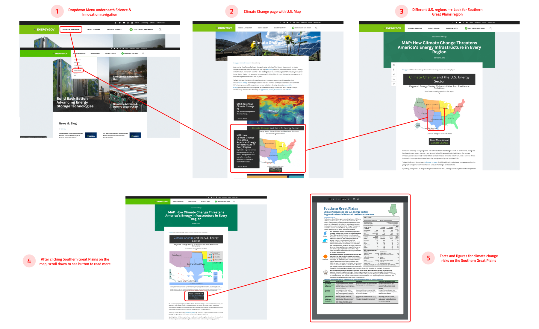
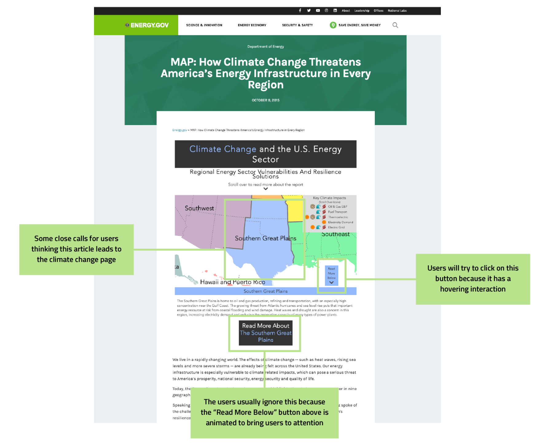
To test out the issues with navigating the Department of Energy website, my teammate and I created a user path for users. After landing on the homepage, users must find the climate change page and look for the US map, where they can learn more about how climate change affects US regions. After landing on the map page, they must search for the Great Plains region and open a PDF for more information about climate change.
My teammate and I did individual user testing on the two tasks below. Here are the findings from the testing:
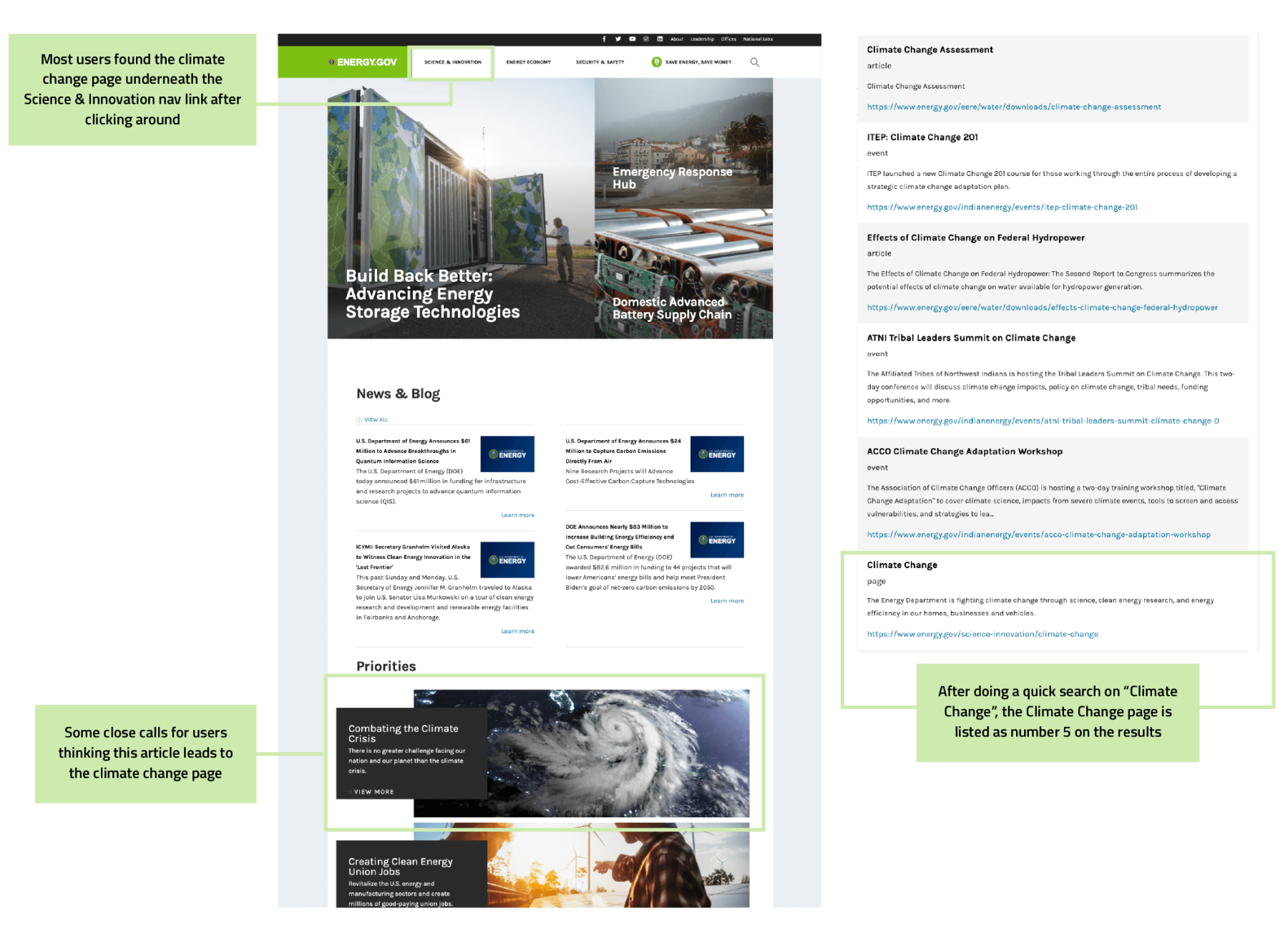
Most users could find the Climate Change page underneath the Science & Innovation navigation. One person couldn't find it immediately on the page, so they searched for it on the Search Bar. Also, one person believed the article with Climate Crisis in their title leads to the Climate Change page and questioned if they were on the right page after landing.
Users successfully found the Climate Change map on the Climate Change landing page. Once they found the Southern Great Plains, most users had issues determining which buttons led to more information since the button is less focused than the animated "Read More Below" on the bottom right of the map.
Some suggested that the Southern Great Plains article should be within the page instead of opening up to a PDF.
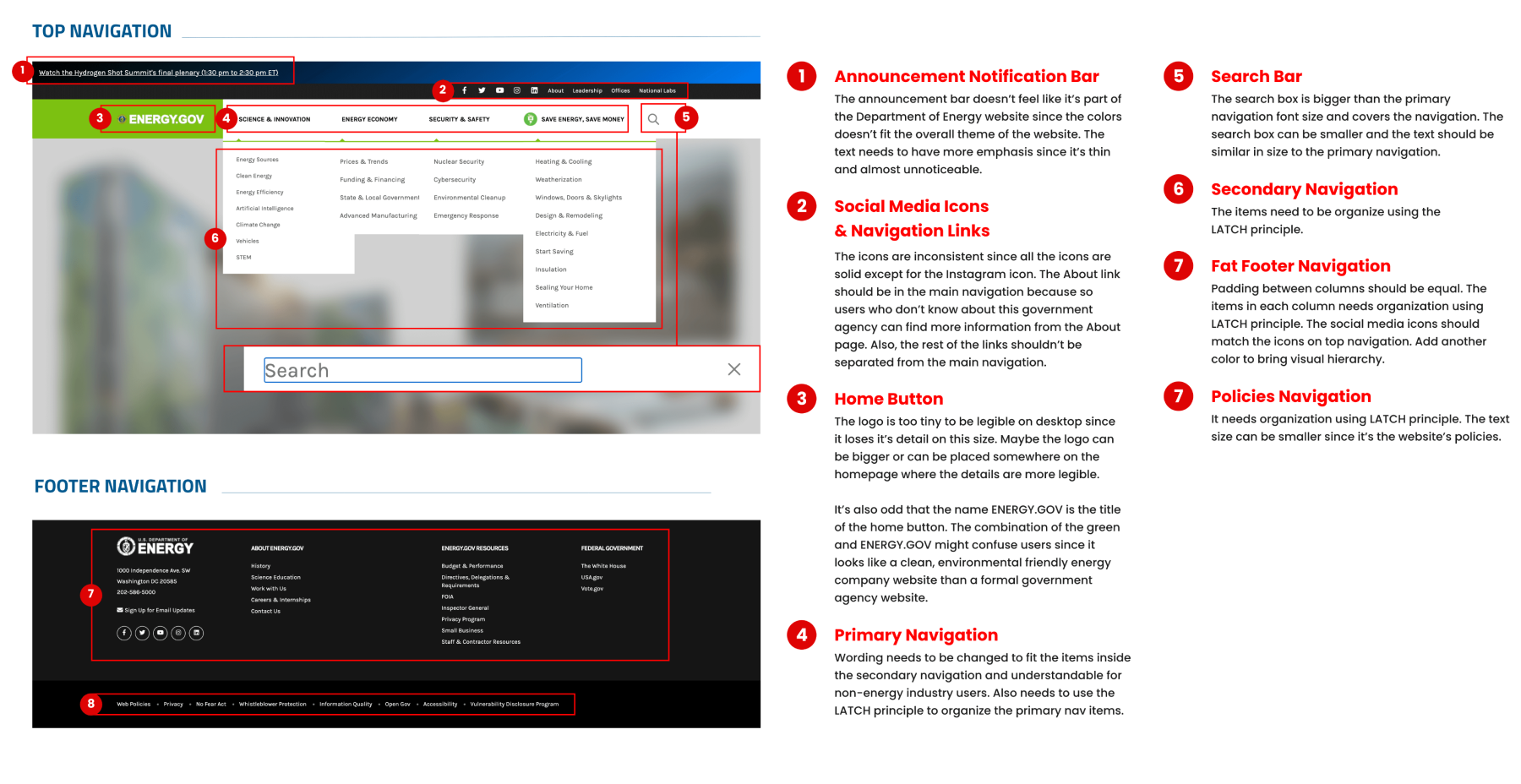
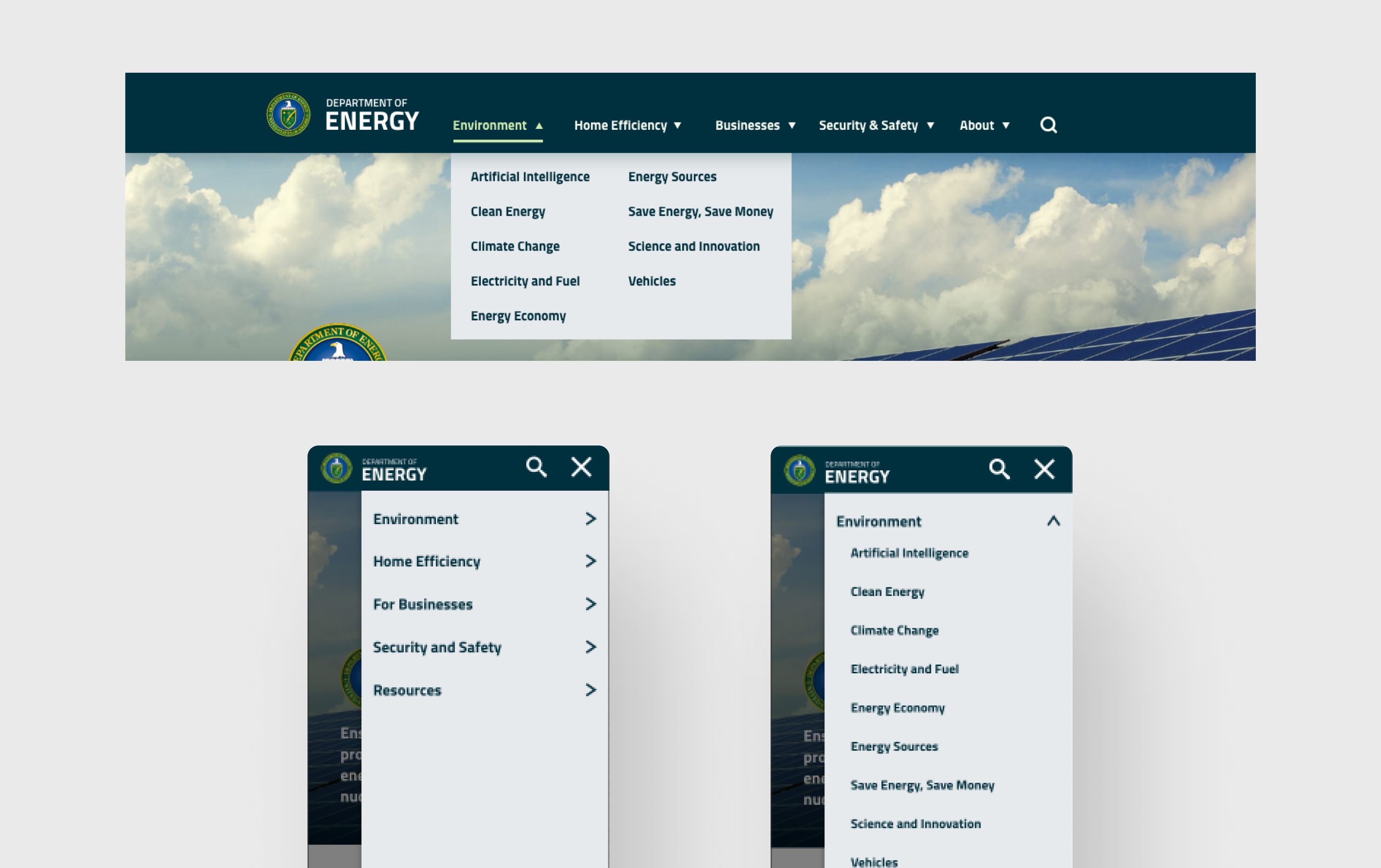
The current website's top and bottom navigation could be more apparent to most users because it needs more organization and follows the LATCH principle. I redlined the desktop and mobile navigation to determine the different UI components and search for issues that need improvement.
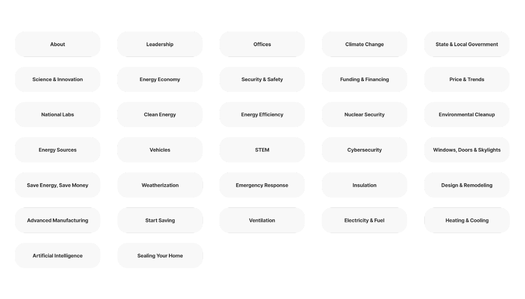
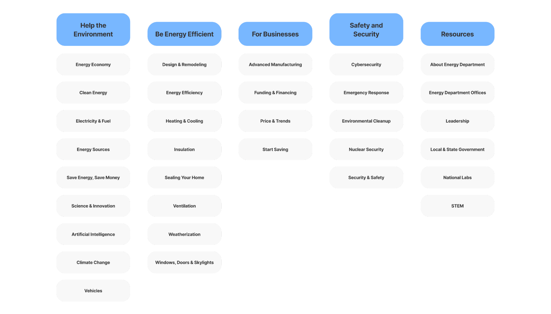
As a team, we divided the navigation links into cards and shuffled them to determine what group they belonged to unaided. After dividing the groups, we labeled them to represent the main navigation links they should go under.
After completing the research, I created the style guide for the redesign. I used a dark teal with a bright, energetic yellow-green as the primary colors to keep the authoritative tone but bring some exciting colors.
The primary typeface I used is Cairo, which has soft yet distinctive angles on the letterforms. I used Hind, another sans-serif, to complement Cairo regarding readability, such as small text.
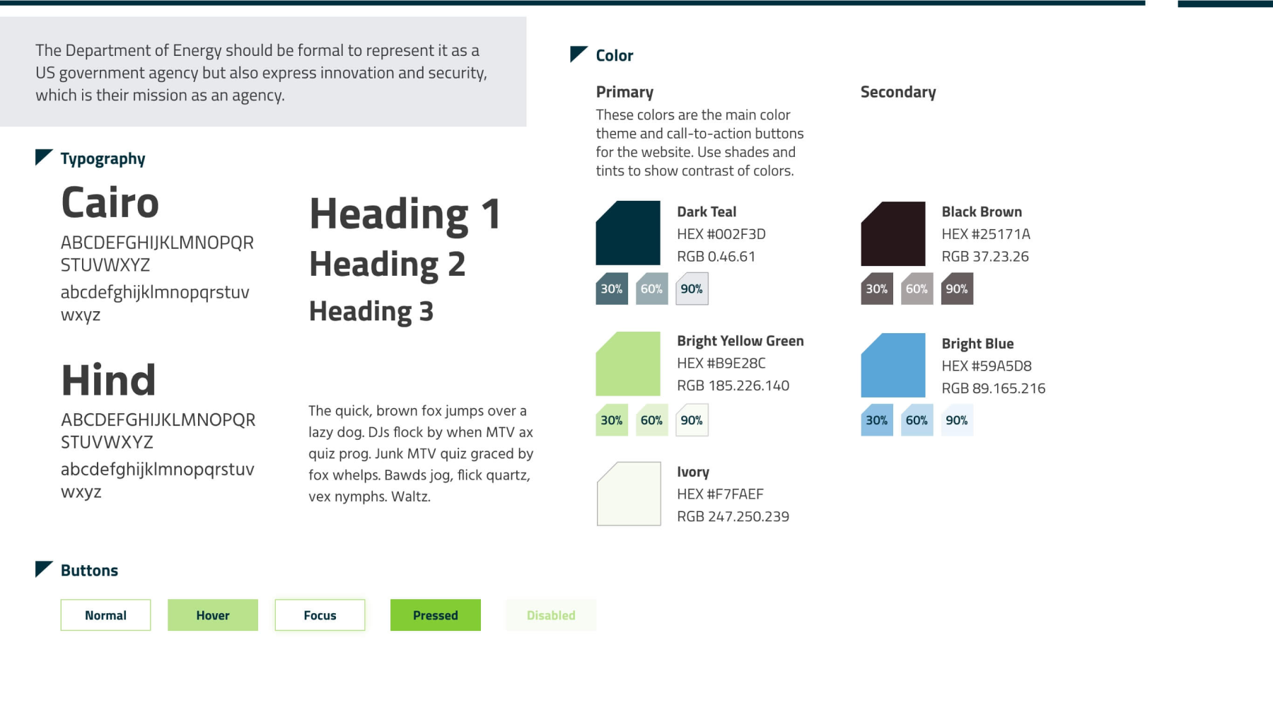
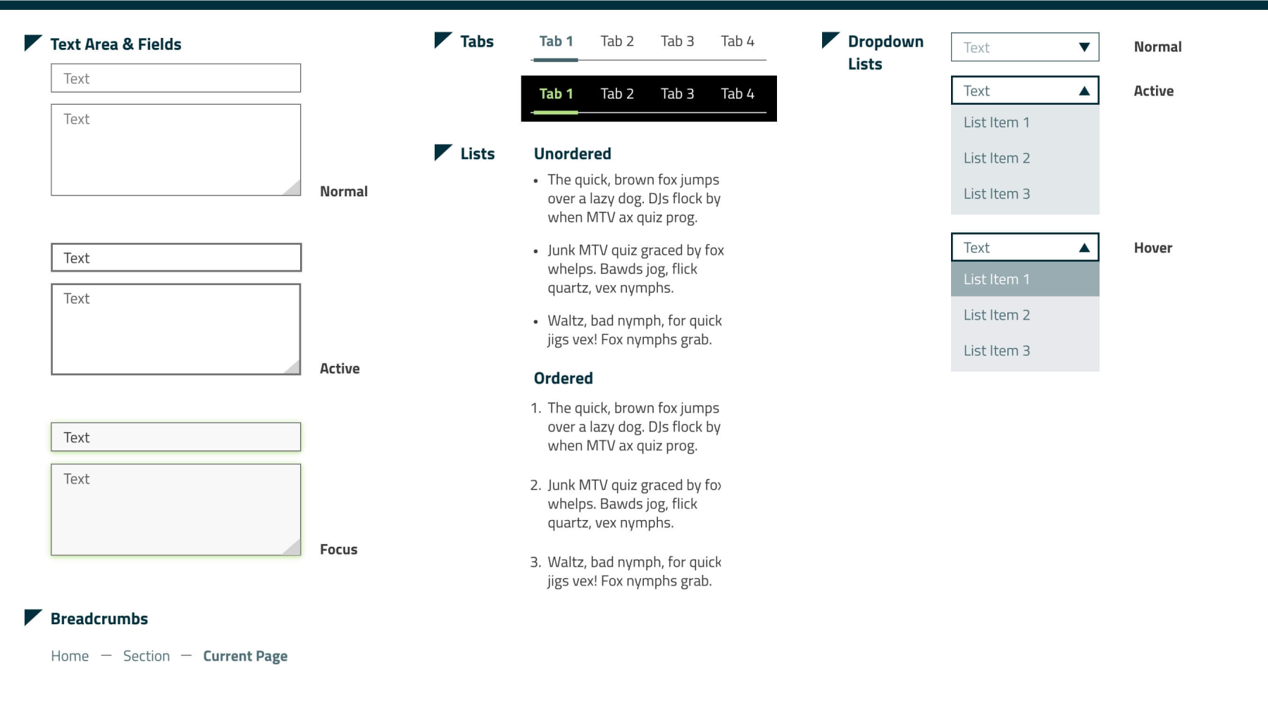
I also styled different user interface components with their states. This style guide will help keep the design consistent on the website and for usability. When the component is active, the text or shapes will be highlighted in dark teal, while the focused state will be highlighted in yellow-green.
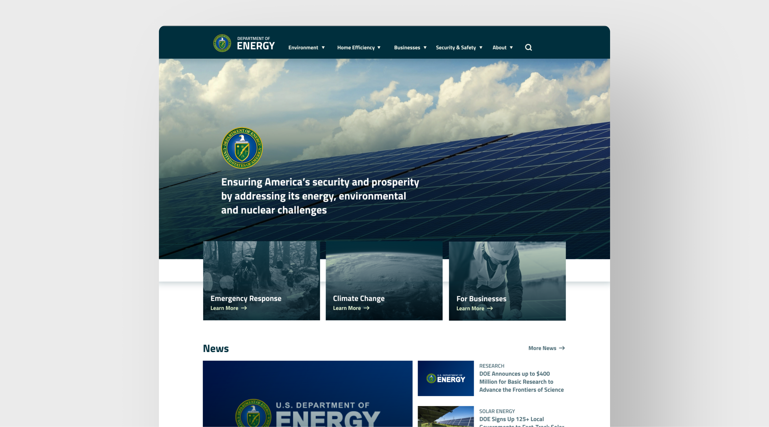
I created two different wireframes on the layout to determine the navigation layout. On test A, I kept the main navigation links to a max three-word limit and had the hero section take up the entire viewport. On test B, the navigation links are in a two-word limit, and cards linked to other pages overlay the hero image and appear above the fold.
After several user testing, users understood test B's navigation links with less word length and liked having the cards peek above the viewport.

One of the issues on the current Department of Energy website is inconsistent component style and accessibility issues such as small text for buttons. I made buttons more prominent by enclosing them in a button or using the yellow-green color for text buttons, which I designed on the style guide.
I also changed the layout to emphasize visual hierarchy and organization. The primary navigation link labels and secondary links inside those were confusing to the average user, so I added more primary groups to break up the long list of secondary links.
The current Department of Energy website shows a three-image grid with energy-related headlines and a wide navigation header with their tiny logo adjacent to their website URL. I added the logo on top of the headline to present the site users are landing on as the US Department of Energy website, emphasizing that users can trust they're on the right site. The logo is also helpful for users who come from another location through an external link.
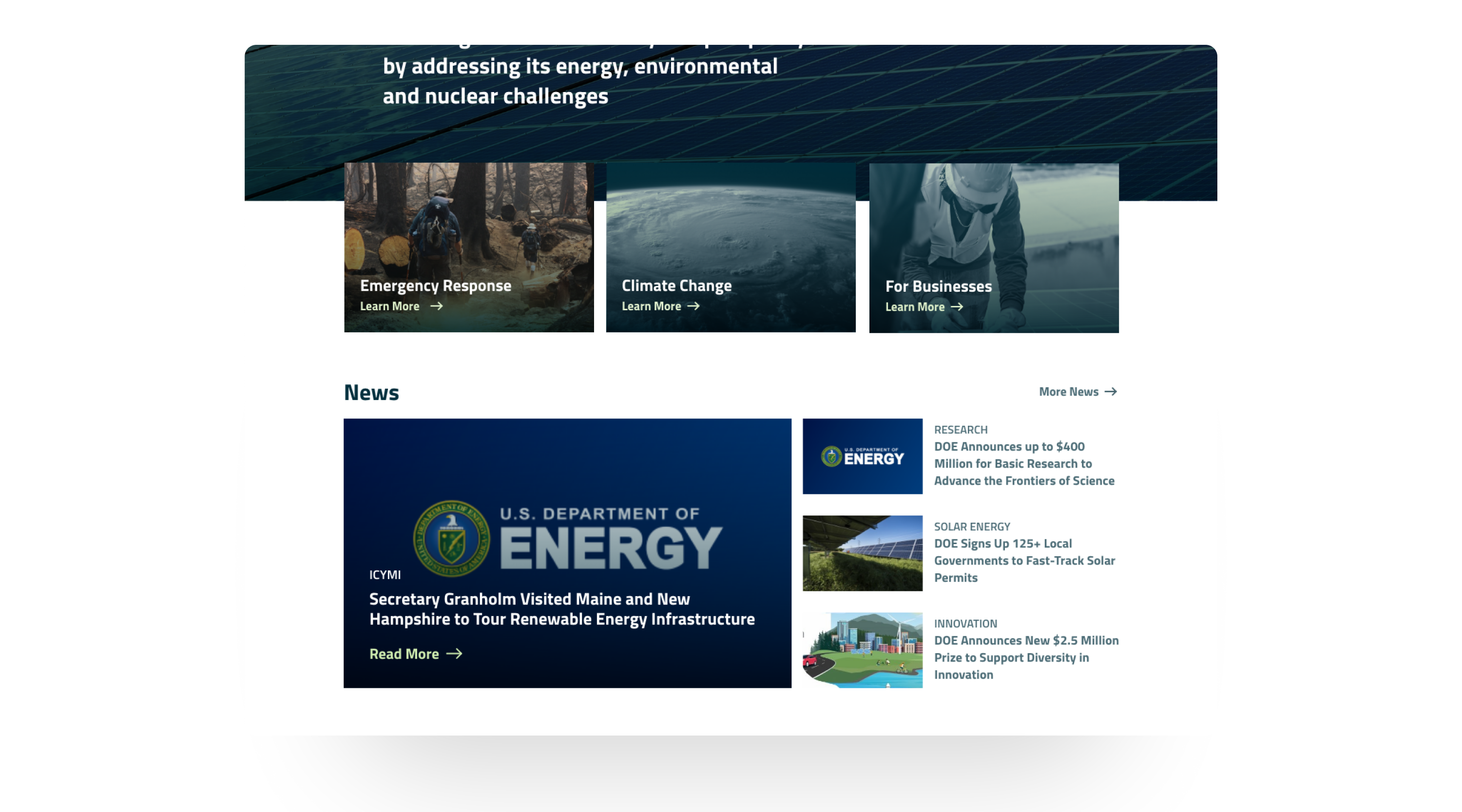
Some website sections don't have clear call-to-action buttons that users can click to move to another page. During our research phase, some users were hesitant to click areas because they couldn't tell it was clickable, and some who clicked needed clarification that the underlined link didn't lead to another page. I added hover interactions to give the user understanding that they can click on areas where they hover over a section.
My teammate and I researched some pages with labels that didn't fit the navigation group and renamed them. After working on card sorting, we decided the navigation should be five groups instead of the original three since it will help the user search for information more accessible than individually checking each navigation dropdown link. I also reworked the mobile navigation and the secondary links so the drawer will appear from the right instead of at the left on the current website.
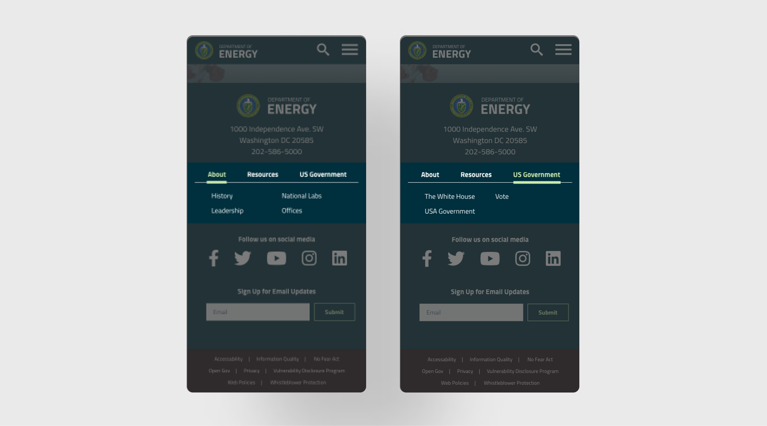
On the footer of the current mobile website, the user taps on the dropdown to see the list of links below three classes: About Energy.gov, Energy.gov Resources, and Federal Government. I made the footer navigation into tabs so the user can see all the navigation links without opening dropdowns and long scrolling. I also shortened the label to simplify the tab labels.
The following steps for redesigning the Department of Energy website are organizing the page layout and creating more hierarchy since the current website needs help finding information and noticeable call-to-action buttons. Also, there's a microsite for the public about maximizing energy efficiency in their homes, which has a distinct layout and navigation from the leading site. This energy-saving website for the public needs a redesign so it looks similar and cohesive to the leading site.
©2023 Michelle Lam