

When life gets busy and people want to maintain a healthy diet, prepping and cooking meals can be frustrating since searching for ingredients in the store takes effort. Also, people don't want to wait in line when they check out in stores during busy hours.
This is an individual project for my apprenticeship and I worked on the user research and interface design while receiving feedback from my peers.
One of the main challenges I had to solve was understanding the customer's experience finding ingredients in the store for meal prepping.
To understand the customer's experience, I wanted to ask three questions:
From my initial research about the grocery store experience, some of the main frustrations shoppers had were waiting in long lines, finding items that weren't available or in stock, and having trouble finding things in the store.
I also created a quick survey to learn more about people's personal experiences with finding ingredients for meals and in-store checkouts. People's main frustrations were finding the ingredients and backtracking in the store. Some suggestions to improve the shopping experience are scanning while shopping, adding the recipe in the app so they can locate the ingredients in the store, and using their digital devices to quickly checkout.
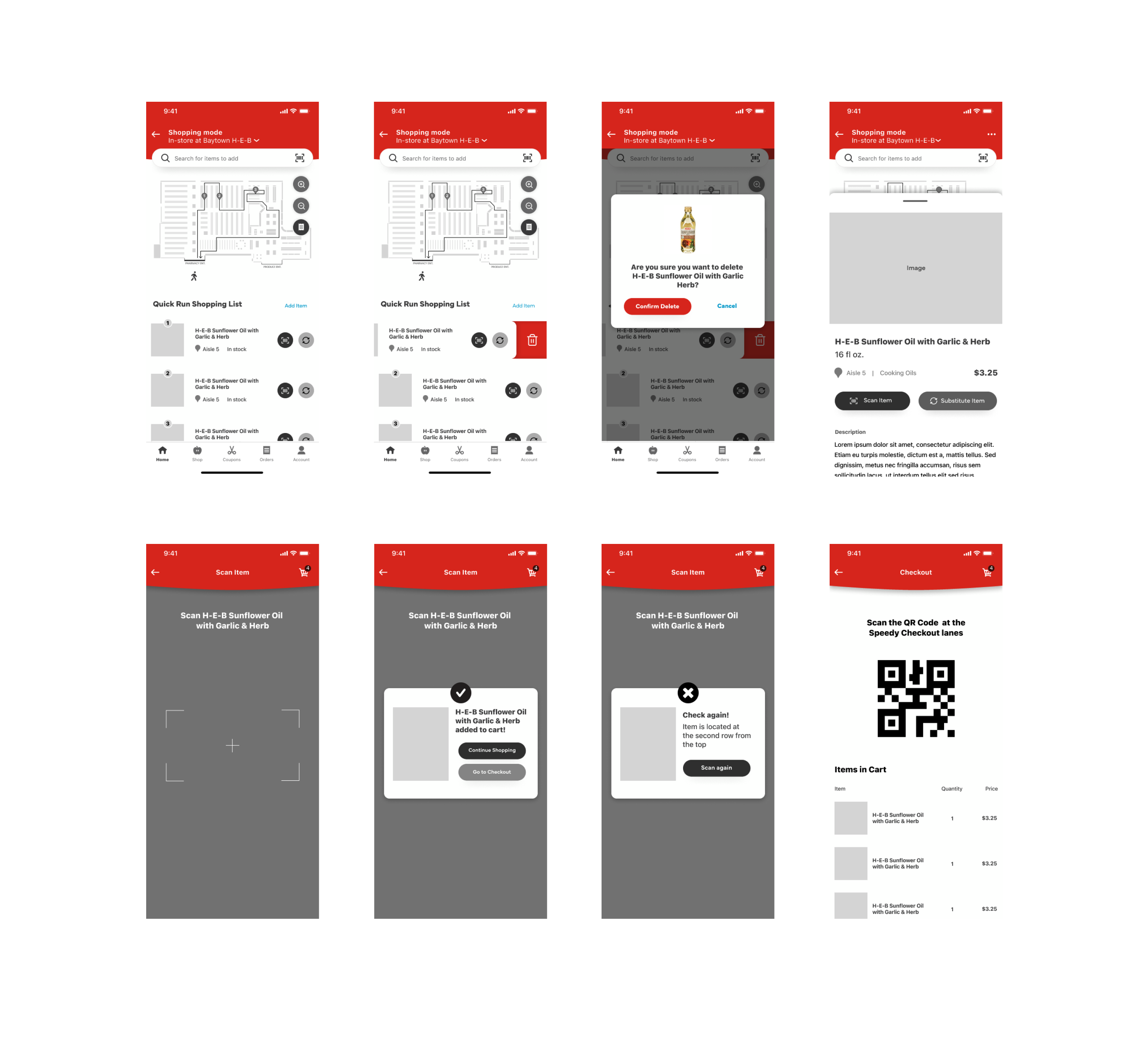
In the store, the shopper can modify the items in their list by swapping or deleting them. Once they find the item in H-E-B, the shopper needs to scan it to use their Quick Checkout feature. If they find the wrong item, the shopper must scan another product to add it successfully. They can choose to add the item without scanning. Once they have scanned or not scanned their items in the list, they can head to the kiosks to check out quickly.
Meal planning can be a time consuming task but can be frustrating to search for ingredients in store. The H-E-B proof of concept will help meal planners pick recipes from the app and locate the ingredients in the store so they can quickly check out.
After checking out HEB’s current app, I researched different store and recipes apps to determine features that are useful for finding recipe ingredients and integrating item searching features in the store.
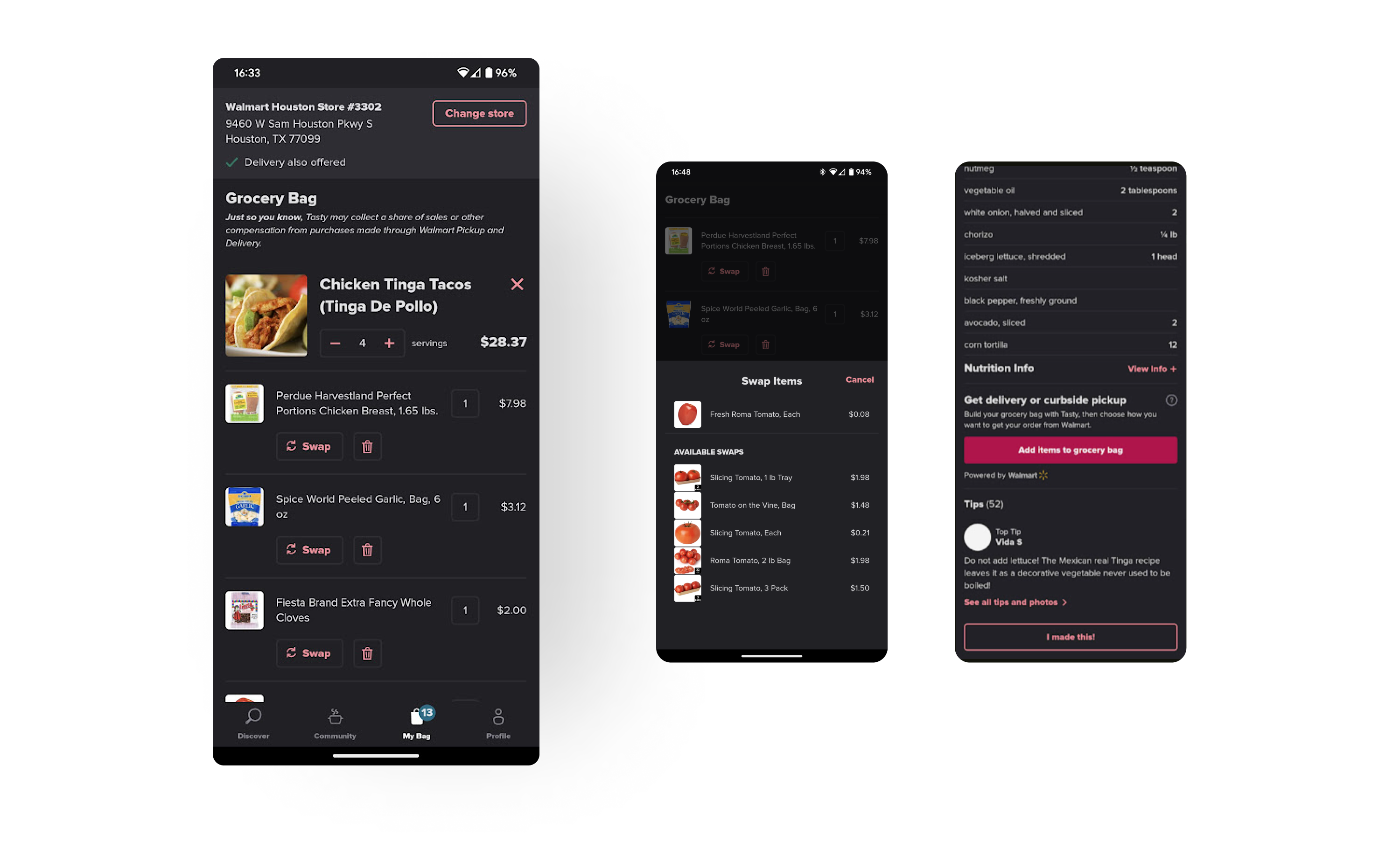
Tasty is a recipe app where users can search for ingredients and cuisines, and the app shows a list of recipes. One exciting feature of this app is that video clips appear for each meal prep step. Although one of the drawbacks of this app is that it's affiliated with Walmart, Tasty does a great job at calculating prices and allowing the user to swap any of the ingredients with another similar product or brand.
Whisk is also another recipe app with features for searching for ingredients and adding any recipe ingredients to the shopping list. Some of the exciting features of this app are changing the serving size, which will adjust the number of ingredients accordingly, and implementing recipes from external websites. Although there are many unique features, the shopping list acts like a note-taking app and only provides a generic ingredient category.
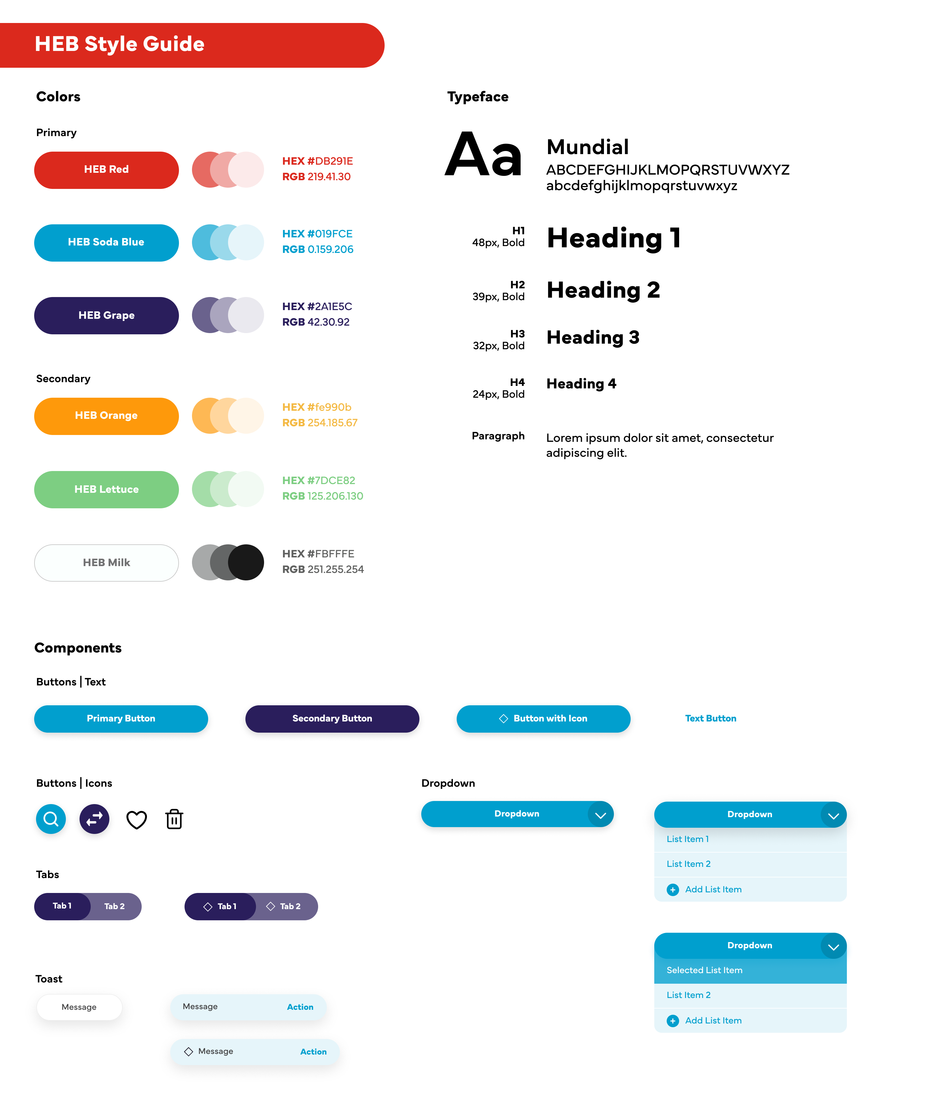
I kept the company's red as the primary color for the colors on the style guide. The soda blue and grape colors complement and contrast the red since red has a negative connotation in UI, and the soda blue color is the primary color to represent call-to-action UI, such as buttons and links.
The primary typeface is Mundial, a clean and friendly sans-serif that is legible in small font sizes. The buttons are rounded and pill-shaped to express H-E-B's friendliness and mission to provide customers with the best quality service and products. Also, other components, such as cards and modals, have rounded corners to be consistent with the buttons.
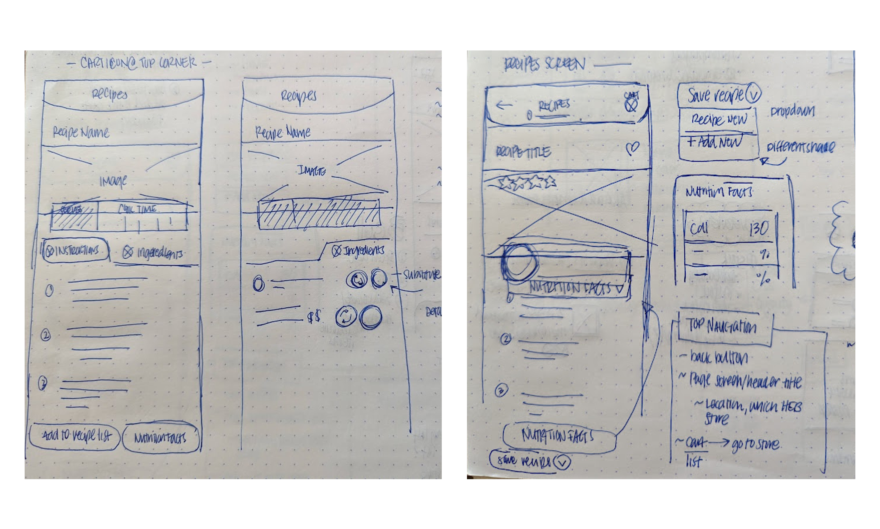
Before designing the prototypes, I sketched the app wireframes based on the app flow. These wireframes illustrate the main screen flows and the page layout for components.
I also designed several iterations of mid-fidelity prototypes on Figma, which I would get critiques on each iteration. During critiques, designers would ask about my layout design and provide me feedback on improving features and different user interactions.
After receiving feedback on my wireframes and mid-fidelity prototypes, I worked on implementing my design system on the high-fidelity prototypes.
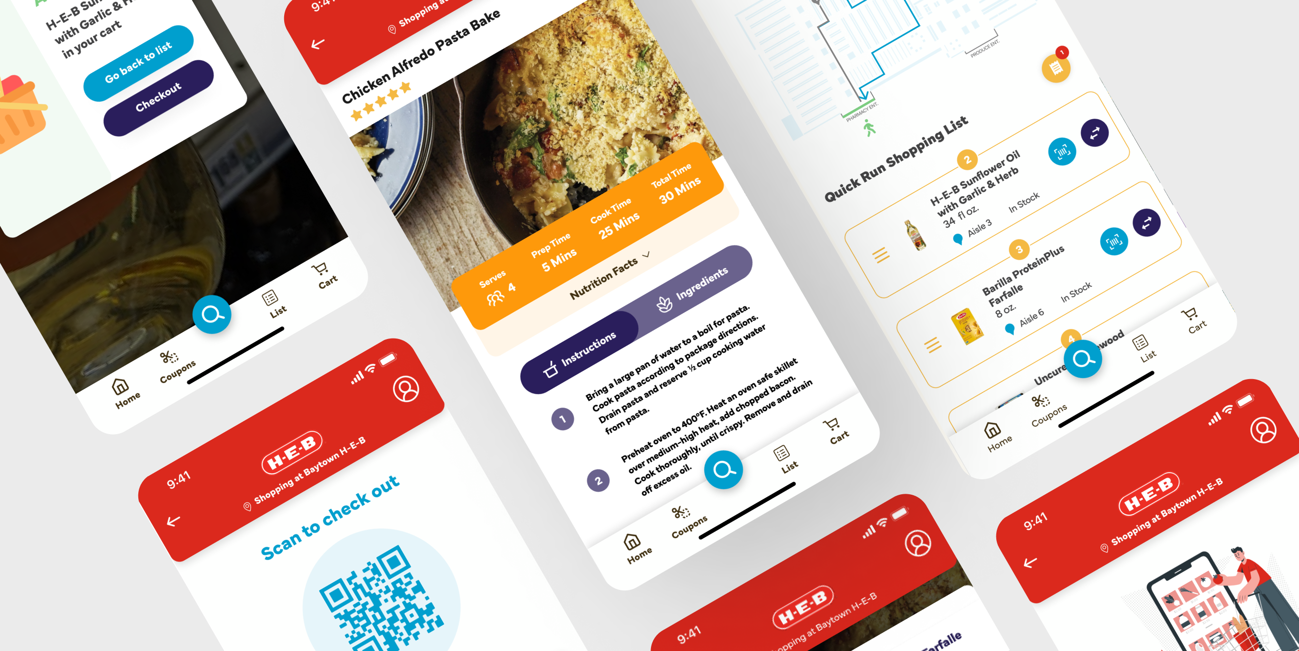
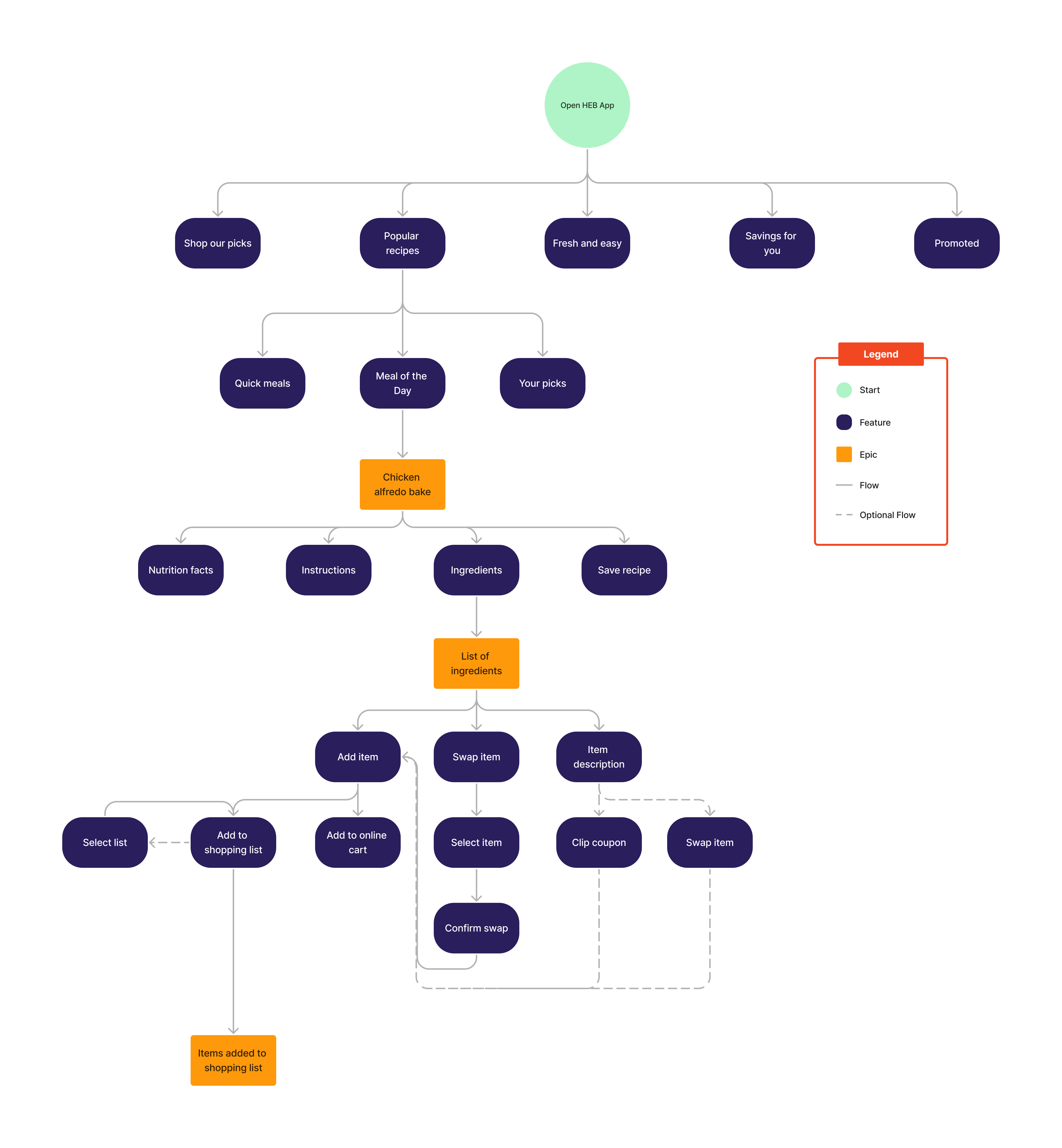
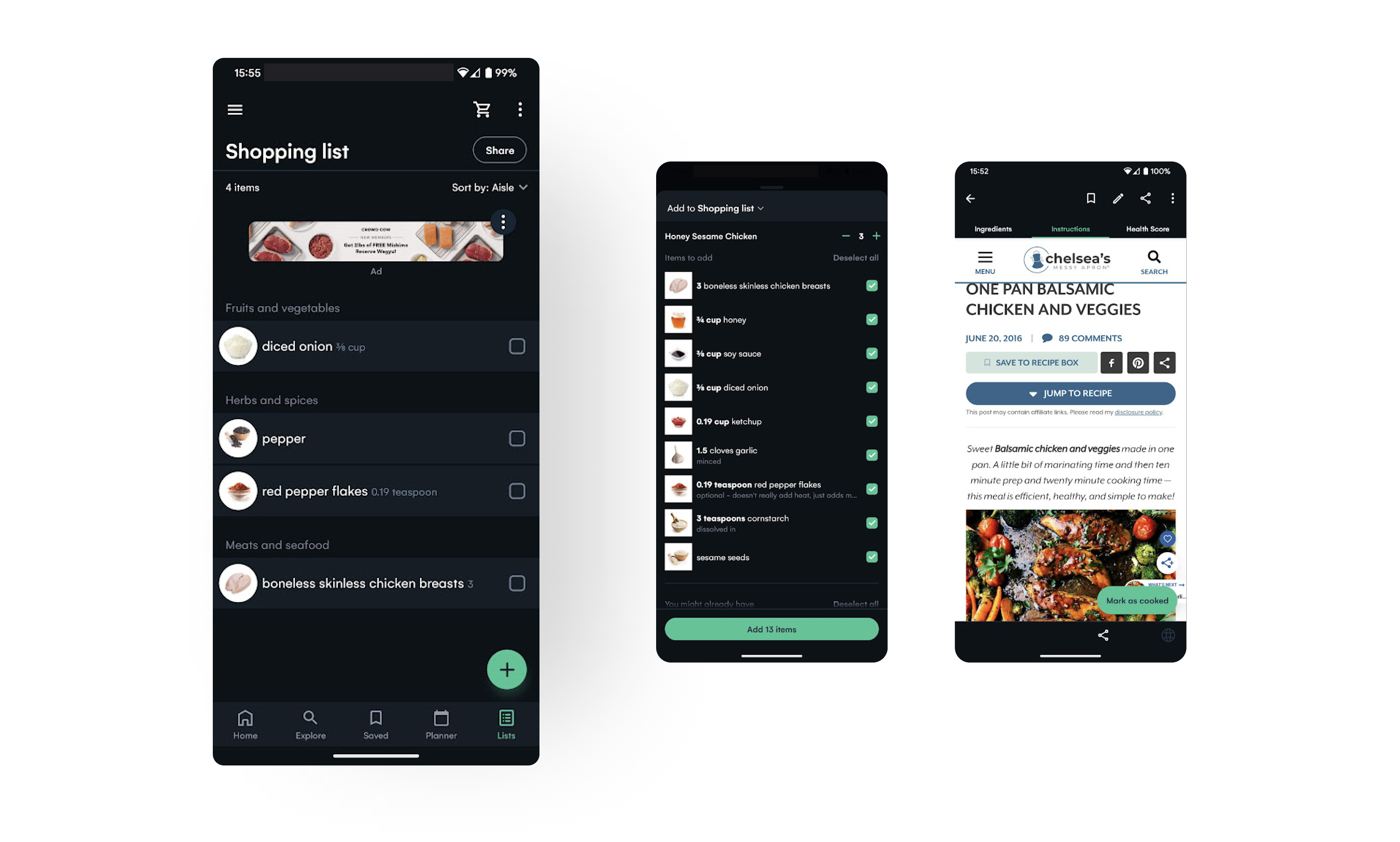
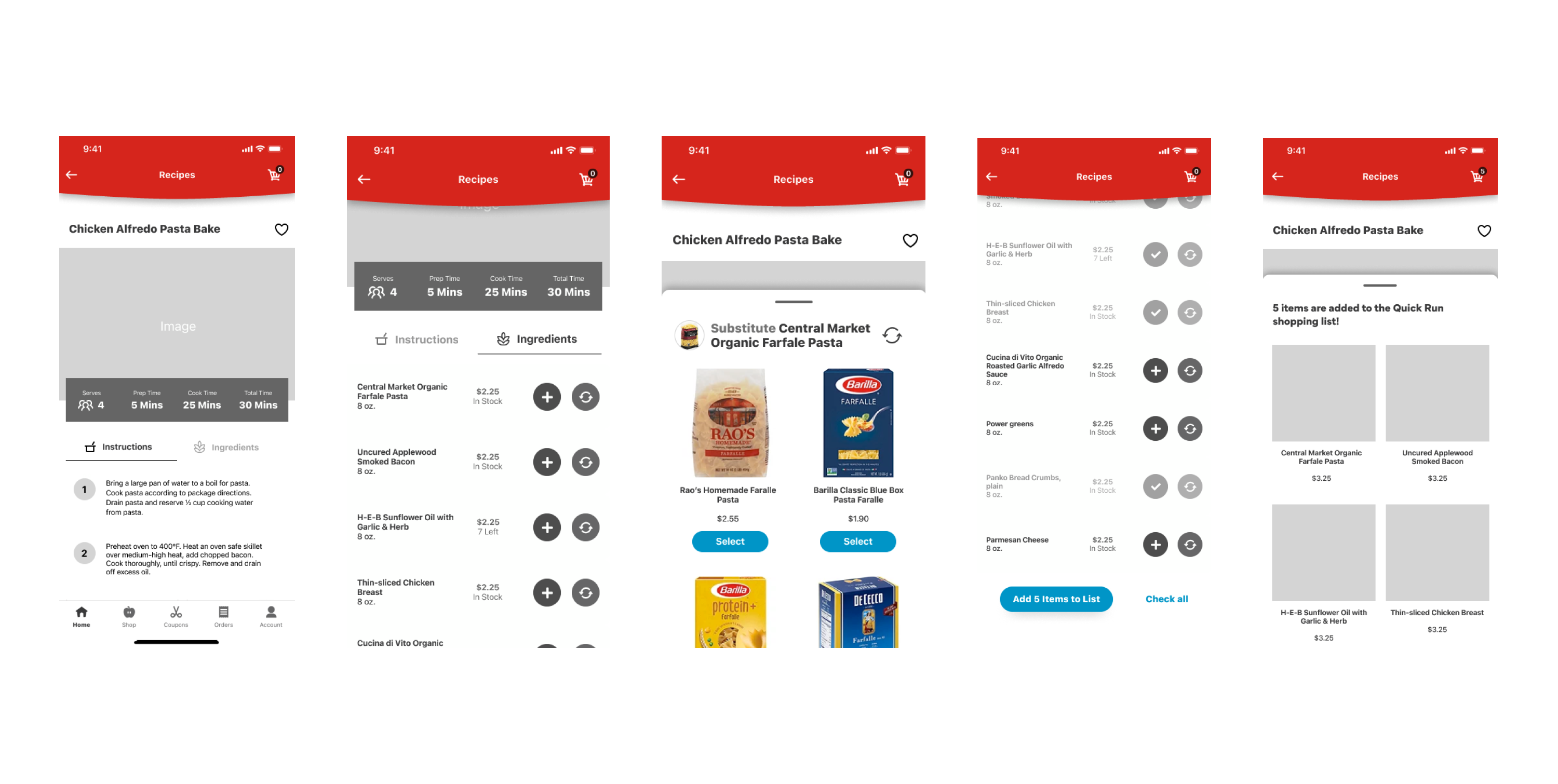
The HEB app doesn't have a recipe feature on their current app, and users must use the browser app to access adding ingredients to their shopping cart. Also, the HEB recipe browser requires the user to scroll long to add ingredients to their cart. In my prototype, I condensed the information into two tabs, one for recipe instructions and the other for ingredients, and placed the nutrition facts in a drawer. The shopper can save recipes on default or customized lists.
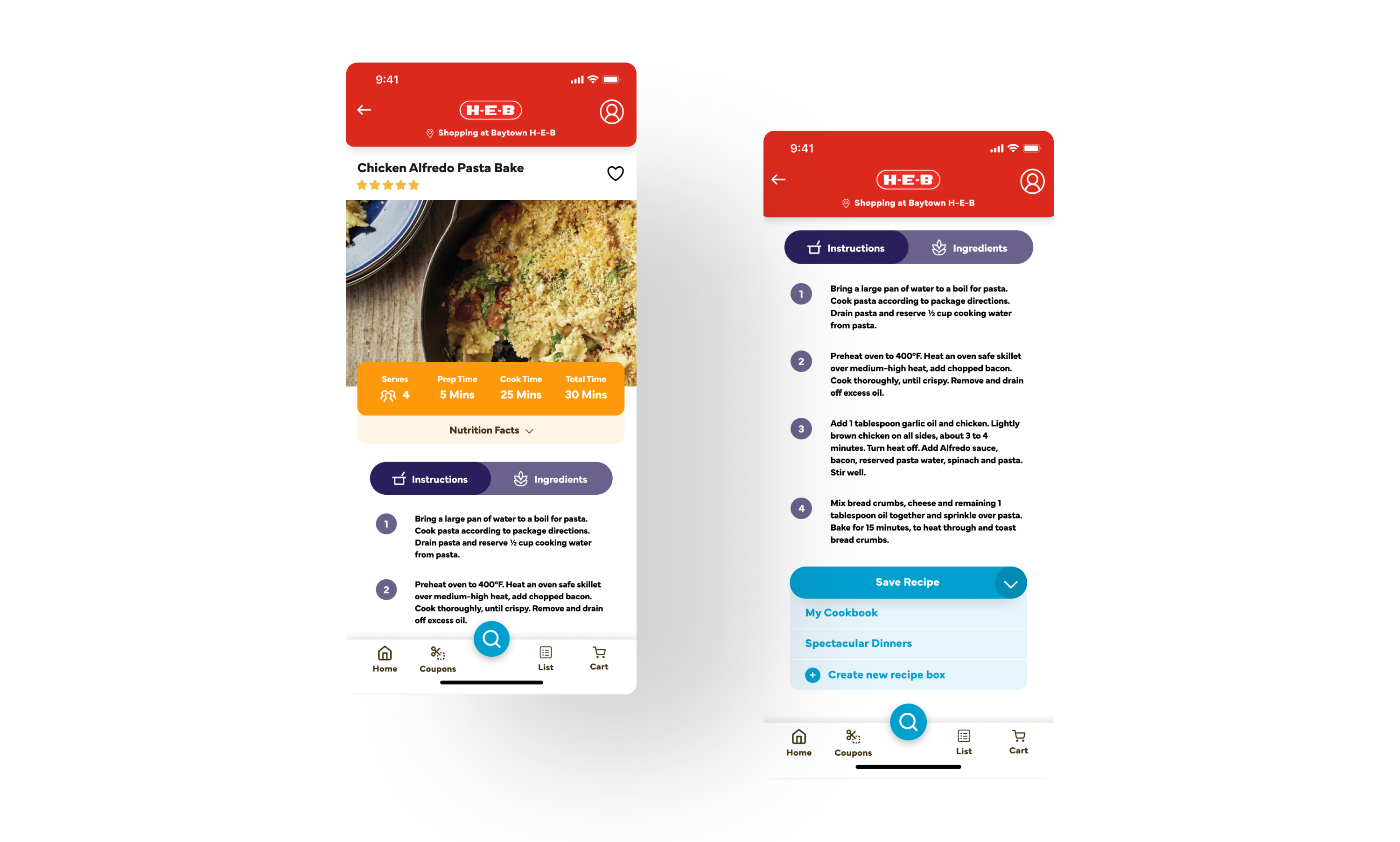
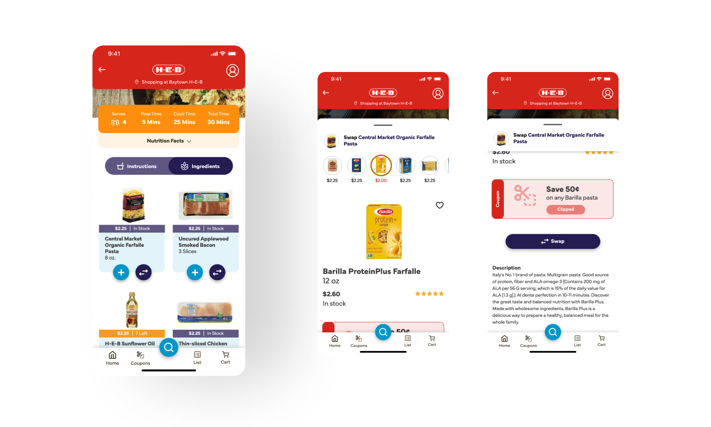
The shopper can check the recipe's ingredients by selecting the purple tab next to the instructions. A list of ingredients will appear with the quantity for each product needed for the recipe. They can choose ingredients they want to add to their shopping list or swap item, which a bottom drawer will pop out, and a selection of items to swap will appear on the horizontal scroll at the top. Items with coupons will have a price tag in red underneath the preview image. Shoppers can clip the coupon and swap the item by selecting the Swap button.
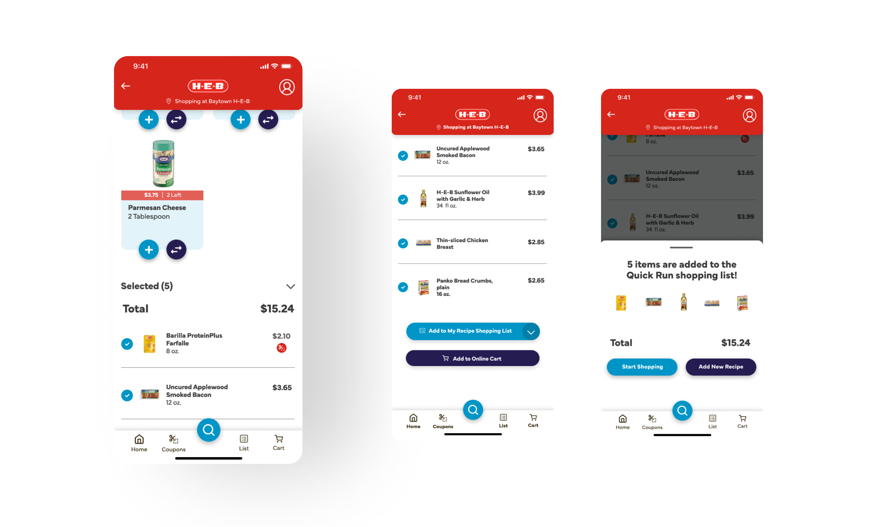
After selecting ingredients to add by tapping the blue Add button, the ingredients will populate below the list of unselected ingredients. Shoppers can choose the default list or a list they created themselves. There is also the option to add to their online shopping cart. Once shoppers add it to their shopping list, a bottom drawer appears where they can start shopping.
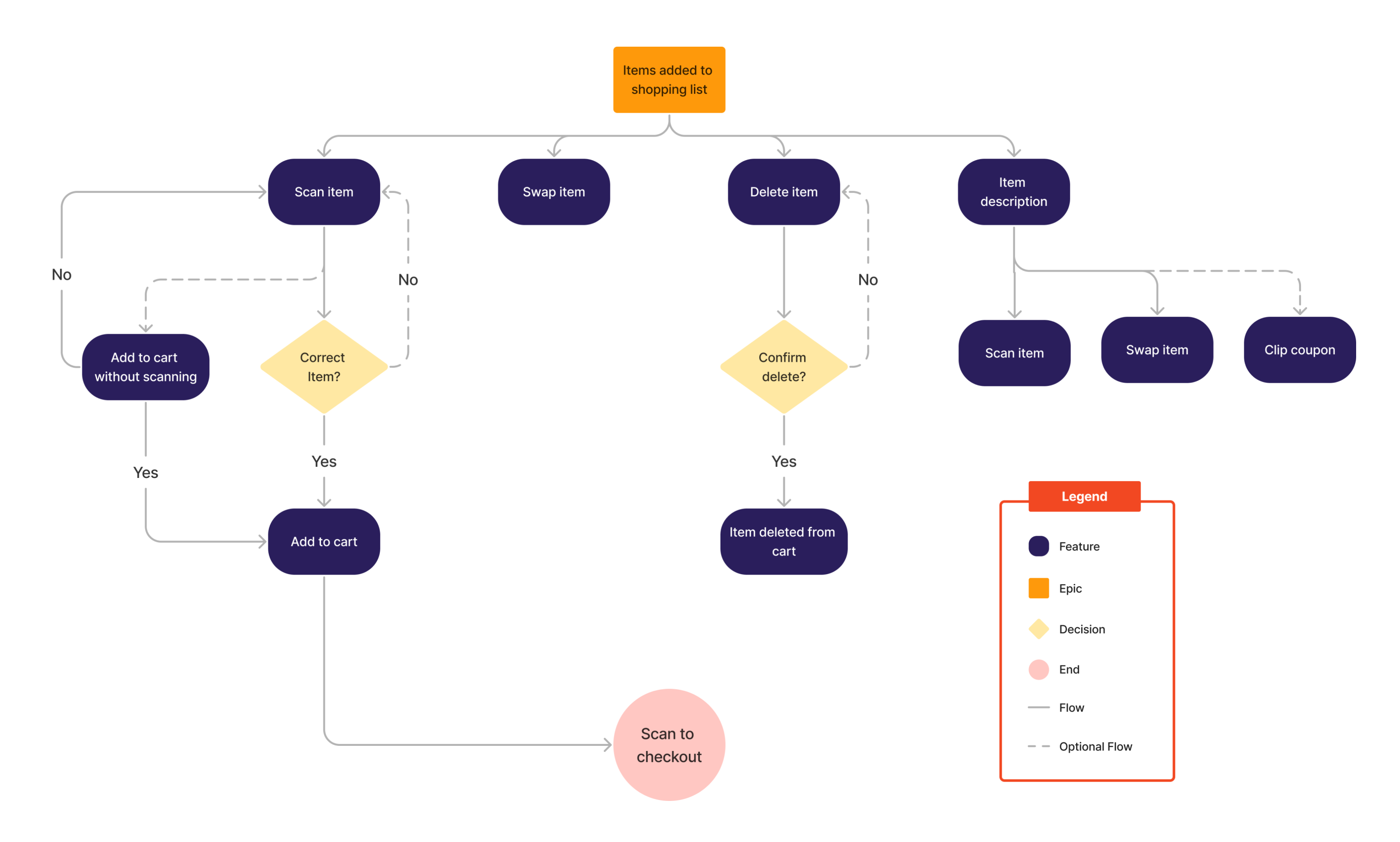
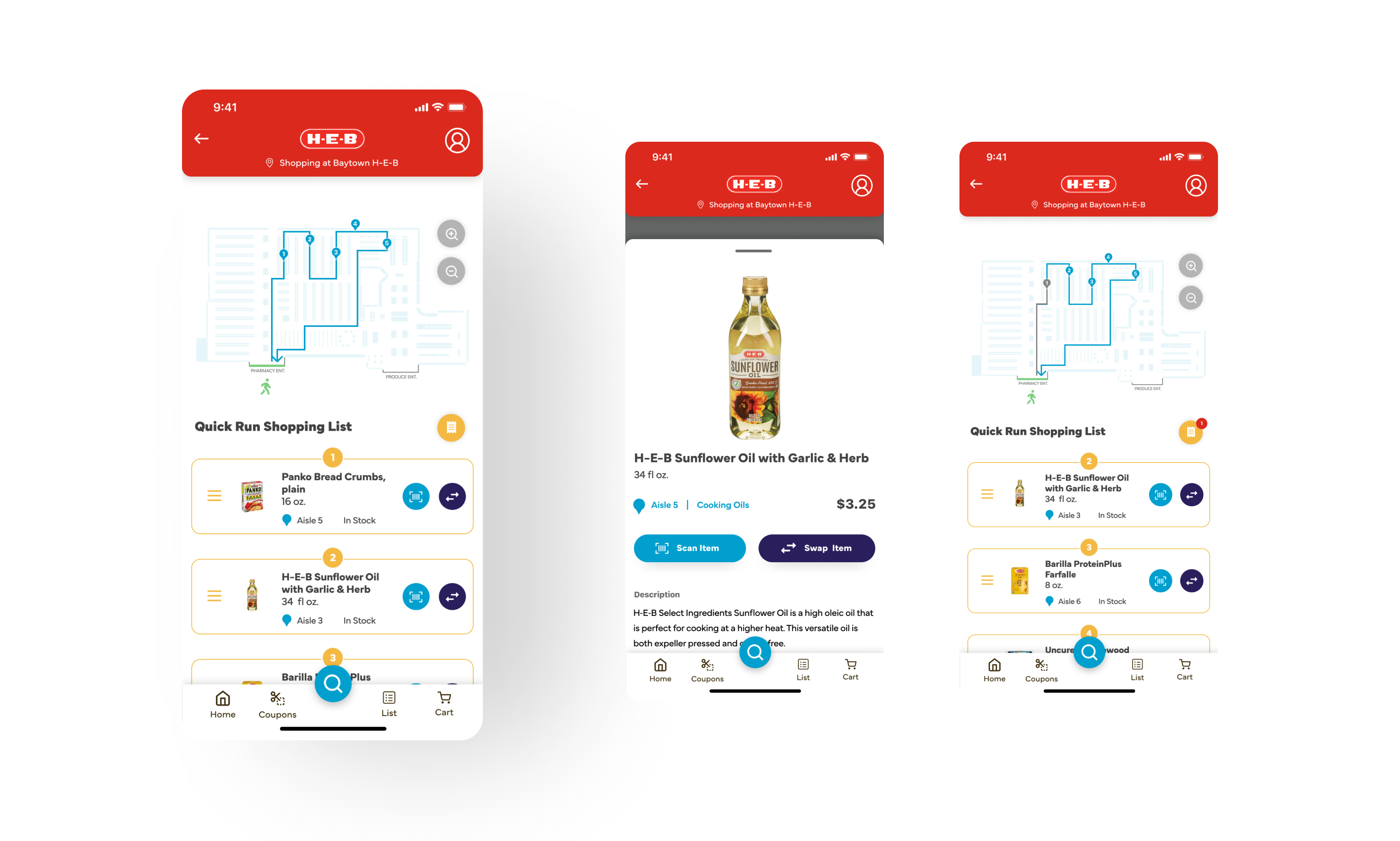
Once the shopper arrives, they can choose which entrance they are coming from, such as the produce or pharmacy area. The app will map out the quickest steps and distance to pick up the ingredients and check out. The steps will appear right below the map, and they can scan the item to place them in the checkout list or swap the item. Shoppers can access the checkout list in the yellow-orange receipt icon next to the shopping list title. This icon will also attach a notification bubble to indicate that items are added to the checkout list.
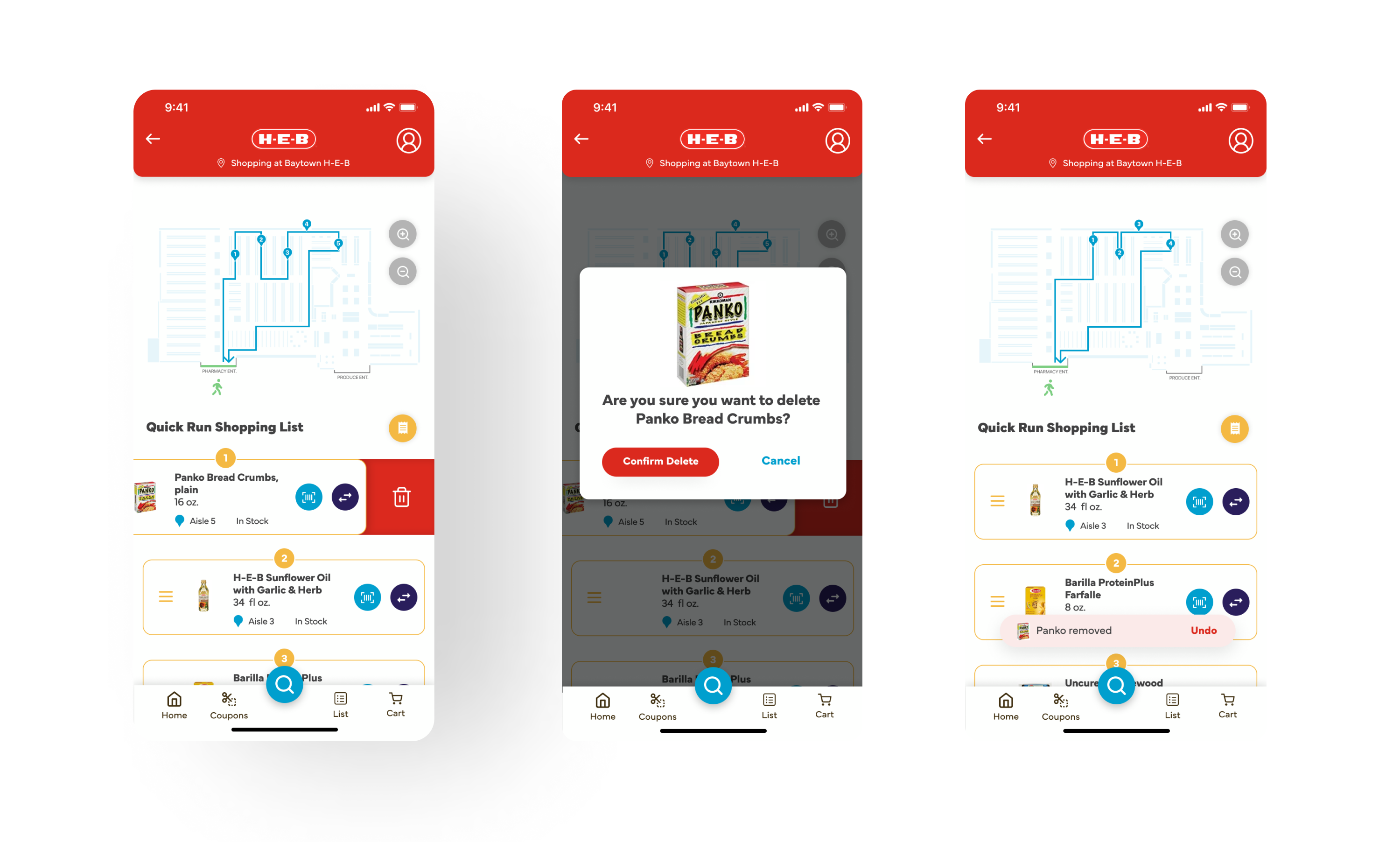
Sometimes shoppers change their minds while shopping and no longer want the item on their shopping list. Shoppers can delete by dragging items to the left, and a trash can icon will appear behind the list item. A modal will pop up to confirm removing the item from their shopping list, and a toast will appear below after confirming. The shopper can also undo deleting an item by tapping Undo before the toast disappears.
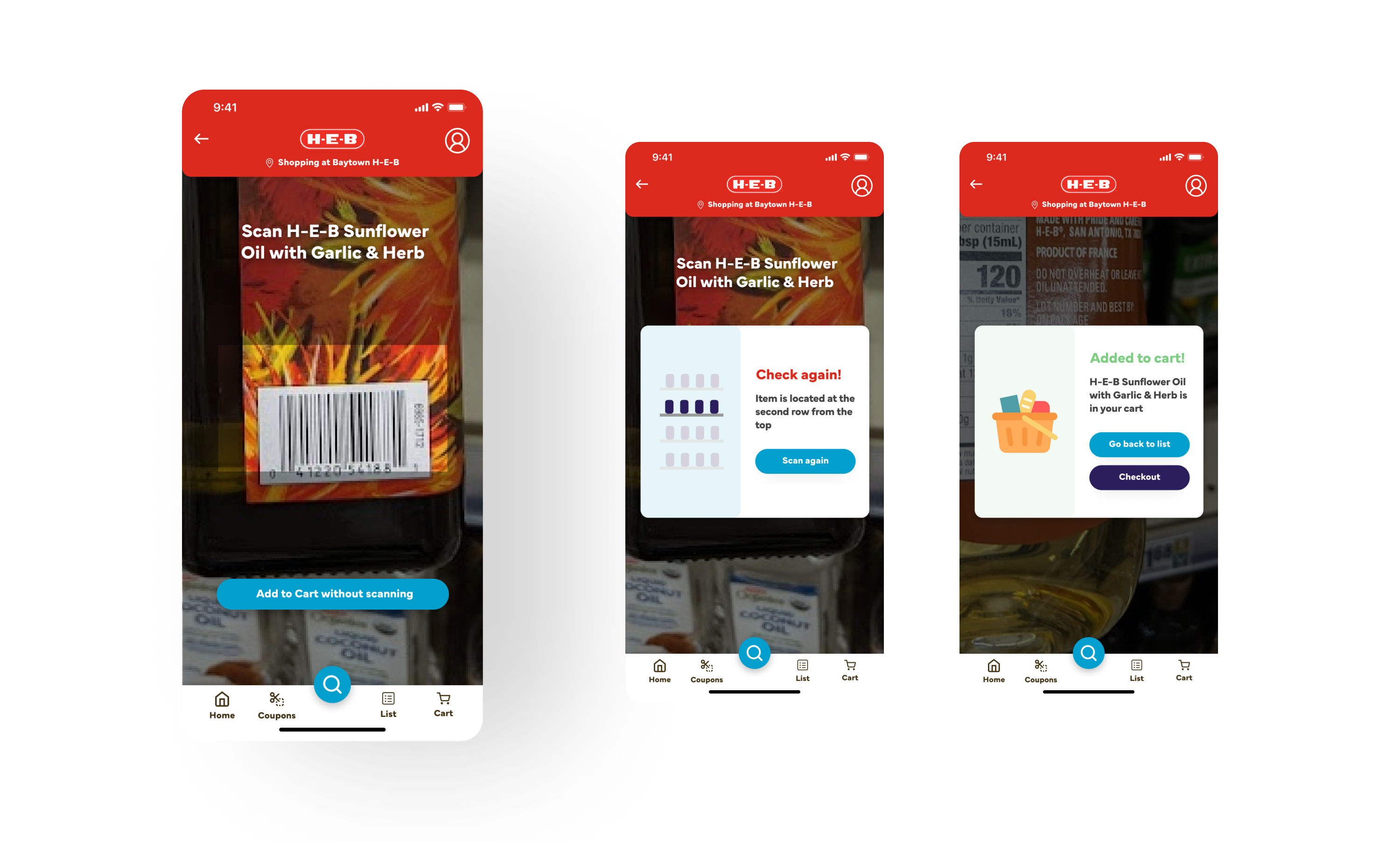
Shoppers must scan the items they collected in the store to use the Quick Checkout feature, scanning and going to the checkout kiosks. Shoppers can tap the blue button with the barcode icon next to the list item on their shopping list and can choose to scan the item or add it to the cart without scanning. If they scan the item, the app will notify them if the item they scan is similar to the one on the shopping list, and if the item is wrong, the app will show where it's located.
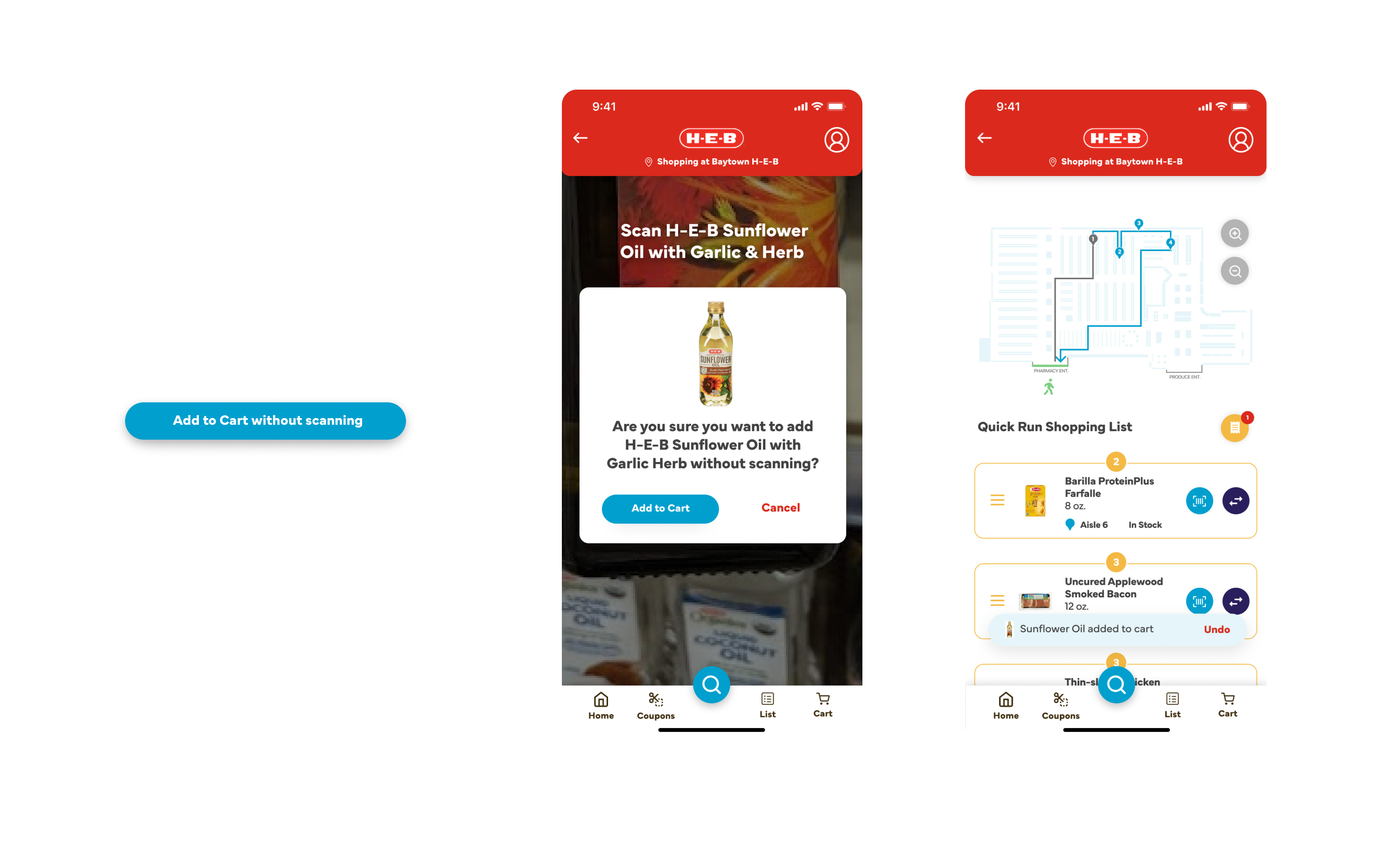
The shopper can choose to add the item to the cart without scanning. After tapping the button, a modal pop up and ask for confirmation. Once the shopper adds the item to the cart without scanning, a toast with an Undo button will appear, and the receipt icon will have a notification showing that the item is ready for checkout.
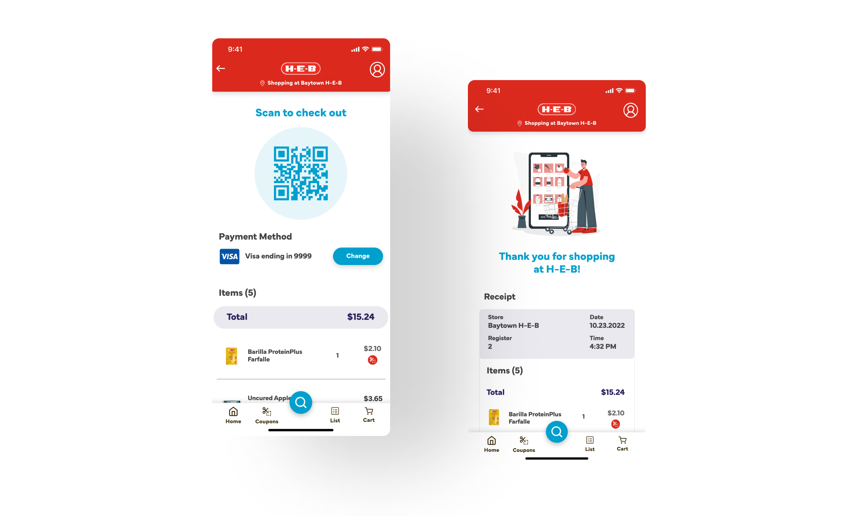
Once the shopper collects all the items on their shopping list, they can scan the QR code to the checkout kiosks. The QR code page has the payment method, which the shopper can change, and the list of items they are ready to pay. After using the Quick Checkout, a Thank You screen and a summary receipt section below it will appear.
In the subsequent iterations, I would like to do more thorough research on shoppers and meal planners and have my prototypes tested to see user thoughts on improving the design. While designing the wireframes and prototypes, I noticed some user flow that needed to be completed. This small design challenge in my apprenticeship helped me understand the design iterative process and collaboration.
Experience the recipe and Quick Checkout features in this interactive on Figma.
©2023 Michelle Lam